carafka
A black and white website for a car photography duo from Kraków and Katowice. The photographs take the lead, and booking a shoot is always within reach.
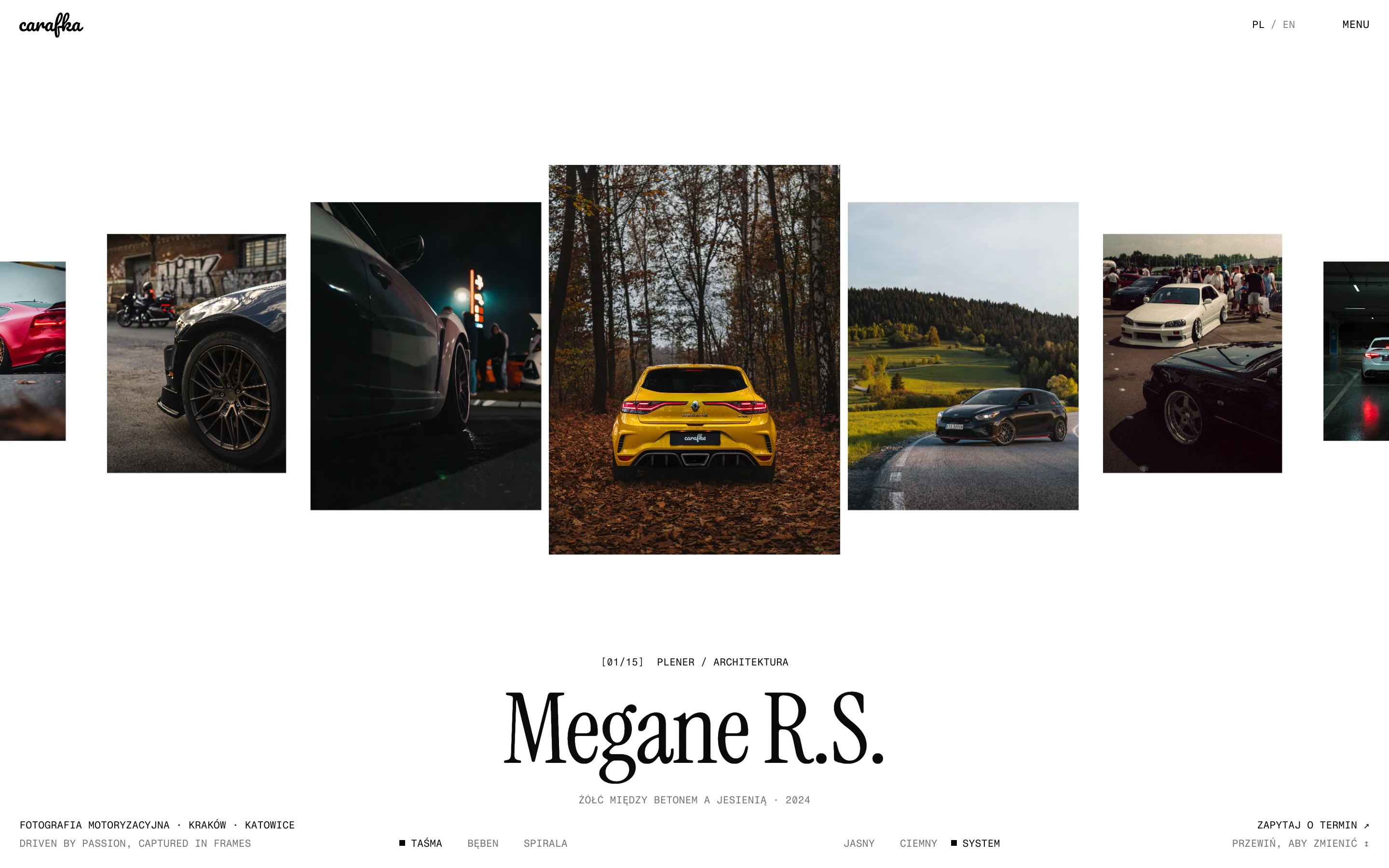
Project at a glance
carafka - an automotive photography portfolio
carafka photographs cars: private shoots, rolling shots and car meets. The logo and the “Driven by Passion, Captured in Frames” motto already existed. We designed and built a bilingual website from scratch that brings every shoot into one place: 15 series with filters, albums and a frame viewer. The interface is black and white, so colour comes only from the photographs. The site runs on free hosting.
- Client
- carafka
- Year
- 2026
- Industry
- Automotive photography
- Platform
- Portfolio website (PL/EN)
- Audience
- Car owners, meet organisers and automotive businesses
- Project goal
- Show the photographs at their best and make booking a shoot simple.
- Status
- Website live on a temporary address.
- Category
- UX/UI · Web design · Development
- Scope of work
- Website information architecture and UX/UI, Desktop and mobile design, light and dark themes, Motion and transitions, Bilingual website built from scratch, Photo optimisation and publication, Contact form, SEO and launch
Results
- 01
Every shoot in one place: 15 series, albums and a frame viewer
- 02
A black and white interface in light and dark themes
- 03
Polish and English versions
- 04
A booking enquiry form with a choice of shoot type
- 05
Hosting at no cost
01 / Context & problem
Where it started.
carafka is an automotive photography duo from Kraków and Katowice. The logo and the “Driven by Passion, Captured in Frames” motto predated the project. We designed and built a website from scratch where the photographs take the lead.
Some shoots used to live in an external gallery. Now every project is in one place: 15 series, from private shoots to car meets, with filters, sorting and a viewer for individual frames.
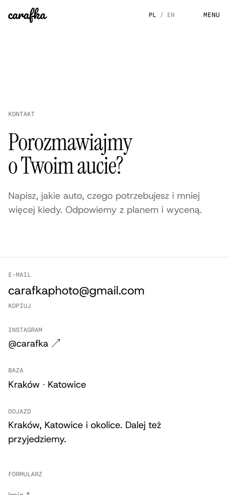
The website is black and white, so colour comes only from the photographs. Contact runs through a form where visitors choose the kind of shoot, delivered straight to the duo’s inbox. Everything runs on free hosting.
02 / Strategic principles
Principles.
- 01
Photographs first
The interface is black, white and restrained. It never competes with the photographs; it gives them space and order.
- 02
Browsing like a gallery
The homepage is a scrolling reel of series, and every shoot has its own album and a single-frame view with zoom.
- 03
A short path to a shoot
Asking about dates is available from every page. The form only asks about the car, the need and a rough date.
03 / Colour system
Colour.
The palette is deliberately monochrome, in light and dark themes. The only colour on the site comes from the photography.
White
#FFFFFFLight theme background
A neutral setting that does not alter how the photographs’ colours read.
Black
#0B0B0BText and dark theme background
Strong contrast for typography and night shoots.
Grey
#737373Captions and shoot details
Separates supporting information from titles.
Light grey
#E4E4E4Lines and dividers
Structures the layout without extra accents.
04 / User flow
The journey.
The website leads from first impression to a booking enquiry: the photographs first, then the duo, then contact.
- 01
See the series
The homepage scrolls through the best shoots one by one, in three modes: strip, drum and helix.
- 02
Browse the work
Every series in one list, split into shoots and car meets, with sorting.
- 03
Open an album
A photo grid with shoot details and a frame viewer with zoom and keyboard controls.
- 04
Ask about dates
A form with a choice of shoot type, answers to common questions and clear error handling.
05 / UX/UI decisions
Decisions.
- 01
- Problem
- A colourful interface would compete with the colours of the cars.
- Decision
- We designed a black and white website with light and dark themes.
- Rationale
- In a photographer’s portfolio, the photographs should be the most vivid thing on the page.
- Impact
- The yellow Mégane, the M4 and the night meets look exactly as they were photographed.
- 02
- Problem
- Shoots were scattered, some in an external gallery.
- Decision
- We moved every series onto the website and added filters, sorting and albums.
- Rationale
- A client should see the whole body of work in one place.
- Impact
- 15 series in one portfolio, with a back link to wherever the visitor came from.
- 03
- Problem
- Several hundred high-quality photographs mean large files.
- Decision
- Photographs are generated as AVIF and WebP in several sizes, and the site is published as static files.
- Rationale
- The browser downloads only the image size it needs.
- Impact
- Full photo quality and hosting at no cost.
06 / Key interface sections
On screen.
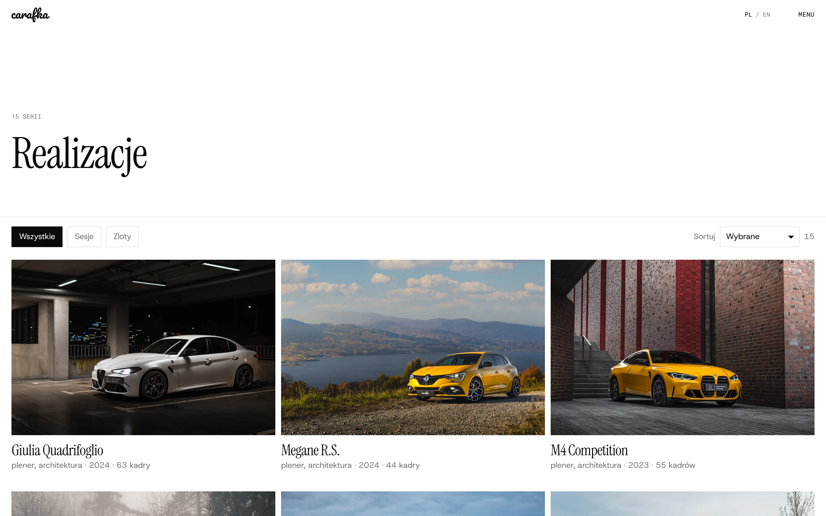
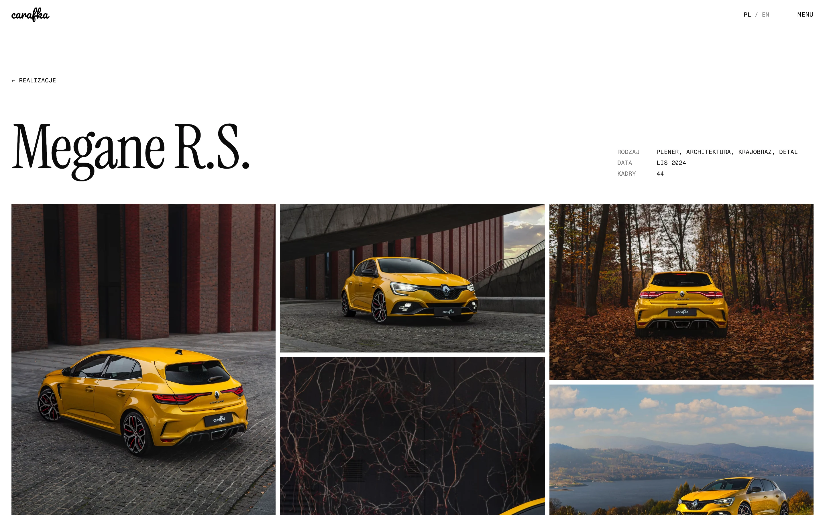
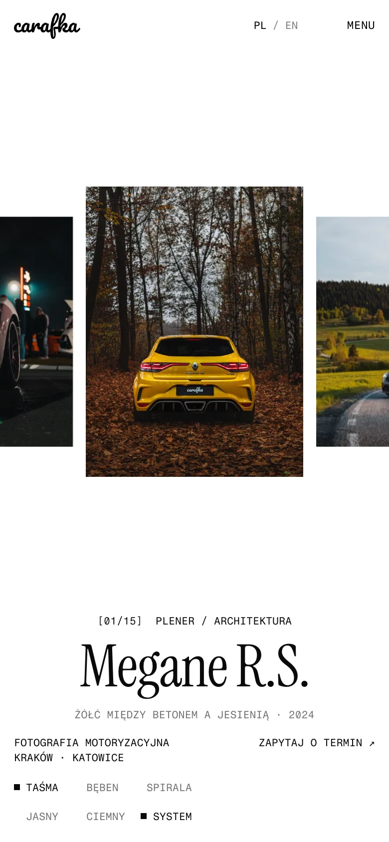
07 / From design to delivery
Build.
The website is bilingual and fully generated as static files, so it is fast and needs no paid server.
- SvelteKit
- Polish at the root and English under /en, with their own addresses for every series and frame.
- Photographs
- AVIF and WebP in several sizes, generated by a script from the photo archive.
- Contact form
- Enquiries reach the duo’s inbox, without a server of their own.
- Publication
- Free static hosting.
The key decision
In a photographer’s portfolio, the best interface is one you barely notice. We held back on colour and ornament and put the effort into browsing, image quality and a short path to contact.
Next project
Highlander
Contact
LET’Stalk.
Does your work speak for itself? Let’s build a website that shows it.
We reply within one working day. We use the details you provide to handle your enquiry.
or email codeandvisuals@gmail.com