Forest green
#193C34
Brand foundation, text, and primary actions
It connects the mountain motif with a mature school identity. Dark surfaces and text on cream give the interface a clear hierarchy.
Technology studio · Web apps, websites & marketing
Logo, identity, and an English school website built around “Your language. Your summit.” From forest green and typography to an interactive course finder and a published site.
Project at a glance
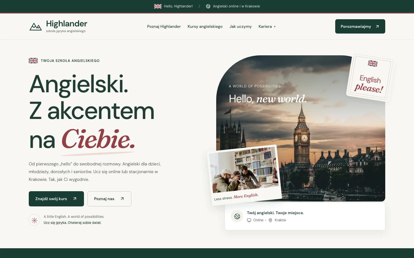
Highlander is an English school brand project with an offer for children, teenagers, and adults, intended for Kraków and online. The scope covers branding, UX/UI, web design, implementation, and deployment. The published preview combines six pages, a course finder, and forms that prepare message text for copying or downloading.
Context & problem
Highlander starts with a simple idea: everyone has a personal language summit. For a child, it might be a first conversation; for a teenager, more confidence; for an adult, ease at work or while travelling. The brand and website needed to make room for these different motivations.
The scope covered the full path from branding to deployment: symbol and wordmark, colours, typography, tone of voice, information architecture, interface design, and implementation. The site presents an English school intended for Kraków and online learning.
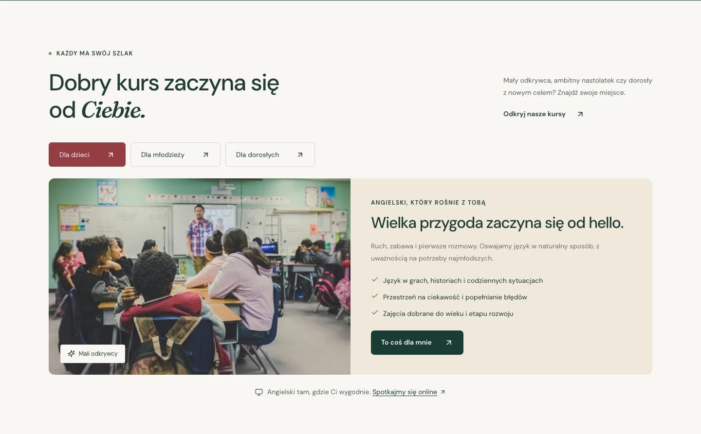
The home page introduces the brand and courses; Offer, About, Careers, Contact, and Privacy pages organise the supporting information. Course tabs, a learning path finder, and short English conversations add practical interactions to the narrative.
The result is a published preview. Forms prepare message text for copying or downloading. Once a real email address is configured, they can open the visitor’s email app; the visitor sends the message themselves. Unsplash photographs serve as illustrations.
Constraints
Strategic principles
The summit motif connects different reasons for learning. Calm visuals and direct language allow the brand to speak to parents, teenagers, and adults alike.
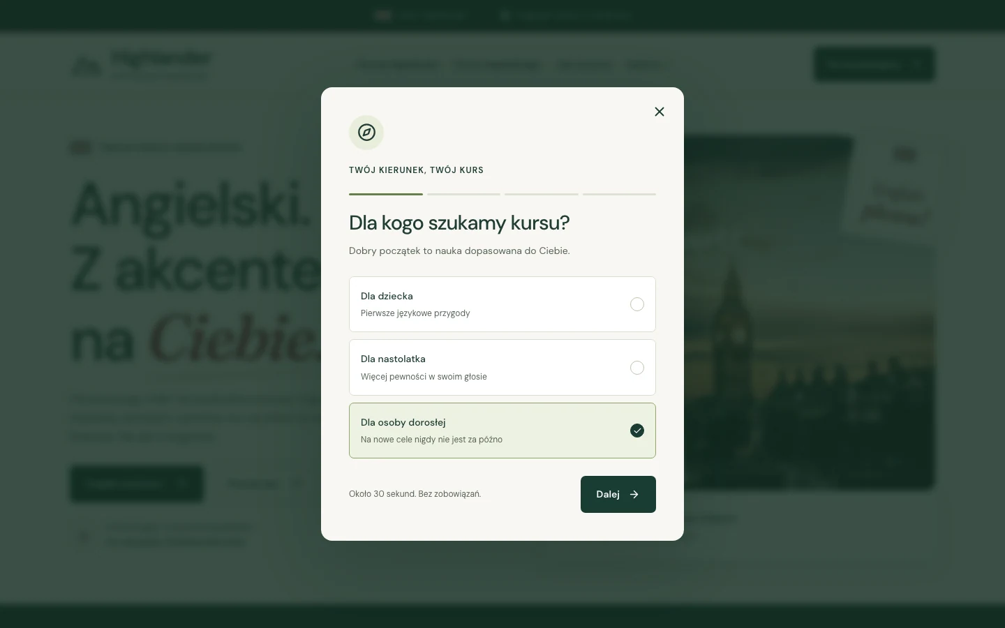
First the learner, then the learning mode and goal. Each course-finder question has a clear purpose, and the answers carry into the contact form.
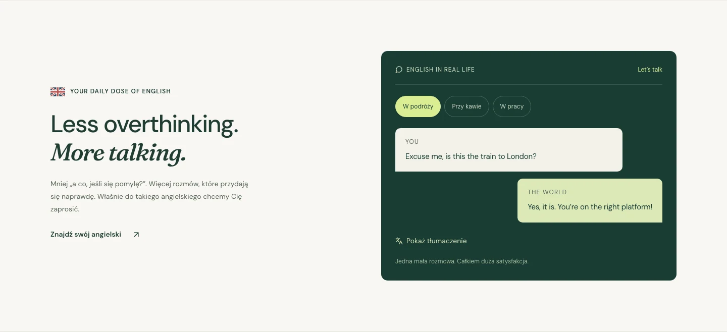
Short scenes from travel, a café, and work show the practical purpose of learning. A translation revealed on demand lets visitors approach the conversation at their own pace.
Creative direction
“Your language. Your summit.” translates the Highlander name into the learner’s personal ambition. The mountain motif gives the identity a direction, while warm surfaces, soft italics, and a conversational voice keep the school approachable.
Brand character
Tone of voice
Short sentences address visitors directly. Invitations to find a course and spend less time worrying about mistakes connect aspiration with a small, understandable action.
What we deliberately avoided
Logo story
An outlined mountain mark connects the Highlander name with the personal-summit tagline. A DM Sans wordmark and the simple descriptor “English language school” immediately establish what the brand offers.
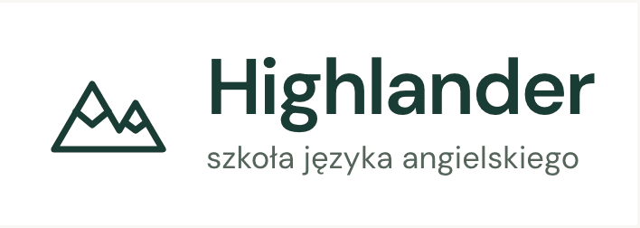
Two peaks evoke different goals and stages of progress while keeping a simple, recognisable silhouette.
DM Sans gives the name a contemporary, approachable character. The descriptor explains the offer without complicating the symbol.
The vector outline stays crisp in the header and footer. The full lockup combines symbol, name, and descriptor; a simplified mark serves as the site icon.
Colour system
Forest green and cream establish a calm foundation. Lime lifts selected elements, while burgundy introduces a warmer counterpoint.
#193C34
Brand foundation, text, and primary actions
It connects the mountain motif with a mature school identity. Dark surfaces and text on cream give the interface a clear hierarchy.
#F8F7F2
Main background
The warm shade gives photography and large headings room to breathe while keeping the site visually soft.
#D9ED92
Accents and highlighted surfaces
It adds energy to the restrained palette. Paired with dark text, it brings attention to selected messages.
#943E45
Secondary accent
It broadens the green system with a warmer colour while retaining the restrained overall character.
Typography
DM Sans carries most of the communication. Fraunces italics highlight key words and give headings a more personal voice.
400 · 500 · 600 · 700
Wordmark, headings, body text, and interface
Twój język. Twój szczyt.
One readable family connects the brand name with course cards, navigation, and forms. Different weights organise the information.
500
Italic headings and accents
More talking.
Organic shapes soften the regular sans-serif structure. Italics distinguish individual phrases while the rest of the page keeps a clear rhythm.
User flow
The journey moves from the brand idea through the offer and preliminary course selection to preparing an inquiry. Each stage adds context for the next step.
The hero introduces the brand promise and invites visitors to explore courses or open the finder.
Tabs organise learner groups. Sample conversations with translations place English in concrete situations.
The learner, in-person or online mode, and learning goal produce a preliminary rule-based recommendation.
The selected preferences carry into the contact form. In the preview, the prepared message can be copied or downloaded.
UX/UI decisions
Key interface sections
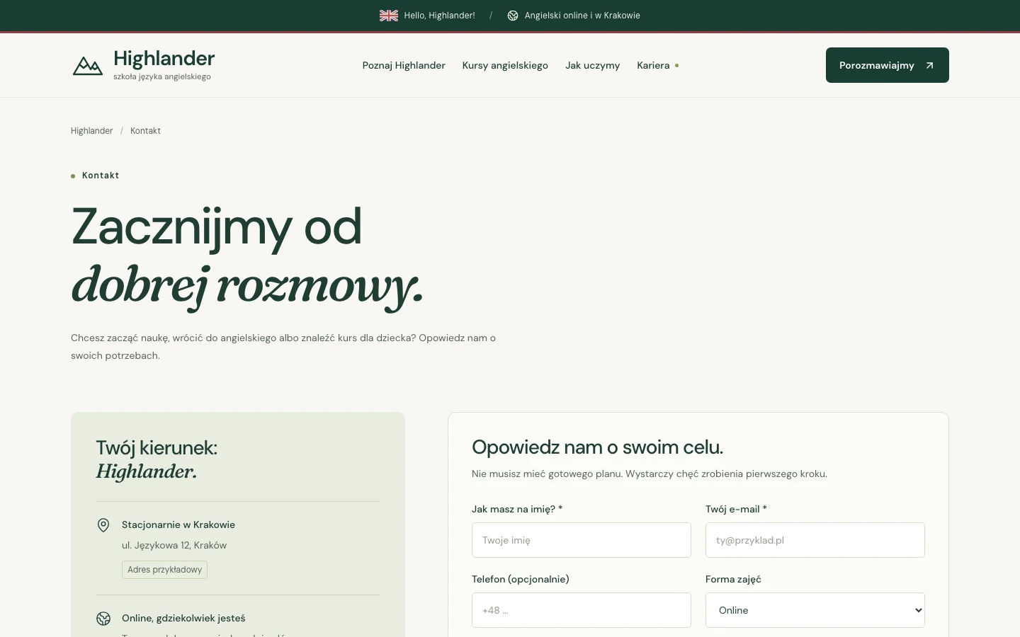
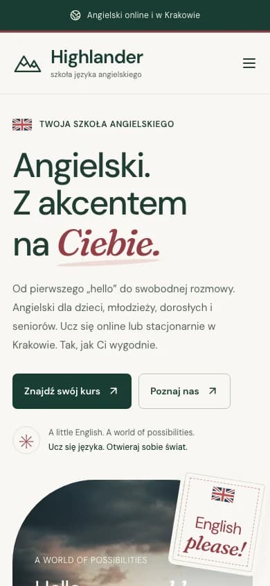
The mobile layout preserves the brand’s typographic character and access to primary actions.
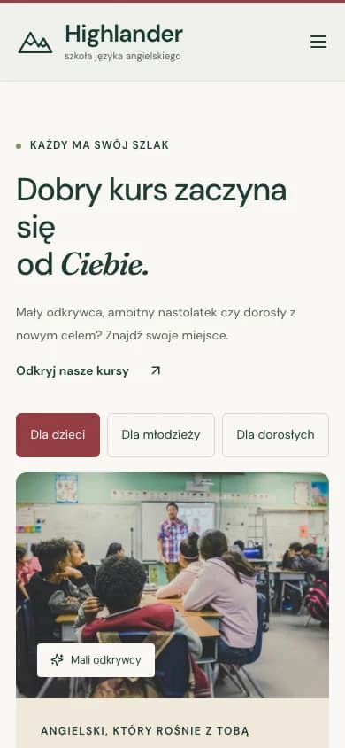
The offer on mobile: learner-group selection and course content in one column.
From design to delivery
The implementation combines a multi-page website with small interactive components. Fonts and images are served locally with the site.
What we delivered
The key decision
Taking the project from branding to deployment connected the brand promise with concrete website behaviour. The personal summit appears in the mark, typography, and questions about learning goals. The key decision was to maintain that coherence through to the form, carrying the visitor’s preferences with it. The next stage requires confirmation of school details, offer terms, and the enrolment process.
Live site
Highlander
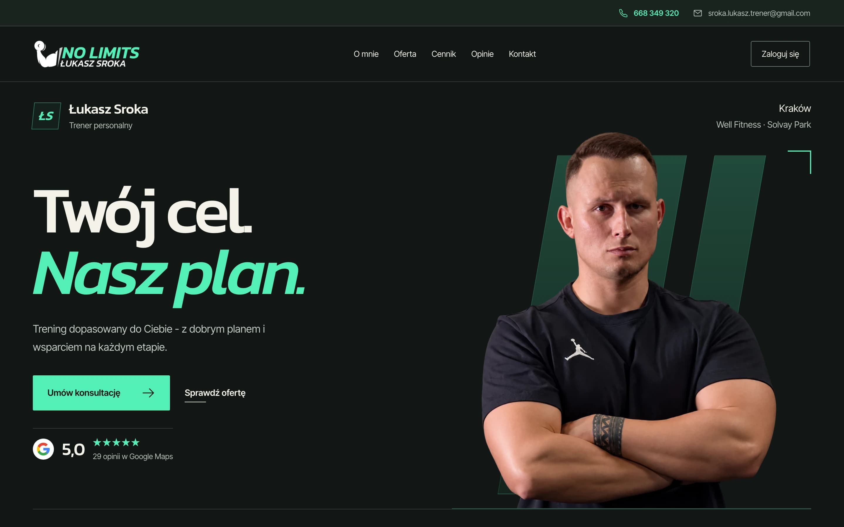
Łukasz Sroka’s website and coaching app. One brand, two dashboards: daily planning and session logging for the trainer, with plans and progress at hand for the client.
Need a brand and website developed as one coherent whole? Let’s talk about your project.