← Back to portfolio
UX/UIWeb designDevelopmentŁukasz Sroka · NO LIMITS2026

NO LIMITS - from first contact to coached training

Łukasz Sroka’s website and coaching app. One brand, two dashboards: daily planning and session logging for the trainer, with plans and progress at hand for the client.
  • Information architecture and UX/UI
  • Landing and supporting service pages
  • Adaptation of the existing identity
  • Trainer dashboard and mobile client dashboard
  • Plans, sessions, scheduling, check-ins, and packages
  • Application and data model implementation
NO LIMITS - from first contact to coached training

Project at a glance

NO LIMITS connects a personal trainer’s public website with an app for everyday coaching. A landing and five supporting pages introduce Łukasz, services, pricing, and contact options. The trainer dashboard covers clients, scheduling, plans, and session logging; the client dashboard provides plans, results, check-ins, and package history. This case study presents an implemented development/demo version with test data.

Client
Łukasz Sroka · NO LIMITS
Year
2026
Industry
Personal training
Platform
Marketing website + web app for two roles
Audience
Prospective clients, Łukasz Sroka, and his training clients
Project goal
Connect the first encounter with the brand to workout planning and everyday coaching.
Status
Implemented development/demo version, verified locally
Category
UX/UI · Web design · Development

Context & problem

NO LIMITS is the brand of Kraków personal trainer Łukasz Sroka. The project brings together two connected experiences: a website that introduces the coaching offer and an app where the trainer and client return to their plan, results, and upcoming sessions.

The public experience includes a landing page and dedicated About, Services, Pricing, Reviews, and Contact pages. Trainer photography, specific coaching options, and an app preview explain what to expect before the first conversation. Contact options lead to a call, WhatsApp, or a prepared message in the visitor’s email app.

After sign-in, the interface serves a different purpose. The trainer organises the day, invites clients, prepares plans, and logs sets during a coached session. Clients check their next appointment, plan, and progress, then share updates through short check-ins. Each role has its own navigation and access boundaries.

The work covered information architecture, UX/UI for the website and both dashboards, adaptation of the existing identity, and implementation of the application and data model. A shared visual system maintains continuity from the first encounter with the offer to everyday use of the plan.

Constraints

  • Keep the NO LIMITS identity recognisable from the website through to the app.
  • Fit the trainer dashboard to desktop and tablet work, and the client experience to a phone.
  • Separate access to client records and private trainer notes.
  • Preserve session history when plans change and keep appointment and package statuses explicit.

Strategic principles

  1. 01

    One brand throughout the relationship

    A shared palette, wordmark, and typographic character connect the website, sign-in, and both dashboards. The public app preview explains its role in coaching.

  2. 02

    Two roles, different priorities

    The trainer needs an overview of the day and items that need attention. The client needs the next appointment, the plan, and a simple way to share an update.

  3. 03

    A session led by the trainer

    The trainer starts and runs the session. The client can view the plan and results, while the app supports coaching on the gym floor and contact between sessions.

  4. 04

    Information with context

    Check-ins carry a date, type, and read status. Older updates and unresolved appointments are separated from current items.

Creative direction

The project extends the existing NO LIMITS identity. Charcoal, mint, bold italic headings, and photography of Łukasz give the website its energy. In the app, that language becomes calmer light cards with clear actions.

Brand character

  • Energy
  • Personal support
  • Consistency
  • Clarity
  • Continuity

Tone of voice

Direct and supportive. The website invites a conversation about goals, while the app states the next action and the status of a save clearly. The product interface is in Polish.

What we deliberately avoided

  • An anonymous admin dashboard appearance.
  • Too many metrics on the home screen.
  • Implying a diagnosis from a check-in.

Colour system

Colours come from the existing brand and are shared by the website and app. Charcoal anchors navigation, mint marks primary actions, and light surfaces support working with plans and results.

Charcoal

#161616

Headings, navigation, and dark sections

Provides a consistent frame for the website and dashboards.

NO LIMITS green

#01B675

Primary buttons and accents

Highlights the next step in contact, planning, and check-ins.

Bright mint

#53F0B8

Highlights and active elements

Adds energy to dark sections and identifies active navigation.

Light app background

#F6F7F4

Workspace background

Separates white cards and gives denser training data room to breathe.

User flow

The journey connects discovering the trainer with a repeatable coaching routine: invitation, plan, coached session, feedback, and the next appointment.

  1. 01

    Meet the trainer and explore the offer

    The landing and supporting pages present the approach, services, pricing, and app. Visible contact prompts lead to a conversation.

  2. 02

    Accept an invitation

    The trainer shares an invitation link. The client creates an account and completes an initial questionnaire about goals and information needed for coaching.

  3. 03

    Set the plan and schedule

    The trainer assigns a plan with days and exercises and organises appointments in the schedule. The client sees the current plan and next session.

  4. 04

    Record a coached session

    During the workout, the trainer logs sets, repetitions, and weight. Session history preserves the workout independently of later plan edits.

  5. 05

    Share an update

    The client reviews results and submits a check-in. The trainer reviews updates, acknowledges reading them, and uses the history to inform further coaching.

UX/UI decisions

01
Problem
The coaching offer and app could feel like two separate products.
Decision
Use a shared identity and an app feature preview on the website, alongside a visible sign-in entry.
Rationale
The app is part of working with Łukasz, so its purpose should be clear before an account is created.
Impact
Visitors can see plans, check-ins, and progress in the context of the coaching offer.
02
Problem
One large dashboard would not serve both roles well.
Decision
The trainer starts with a Today view. The client dashboard highlights the next step and uses bottom navigation on mobile.
Rationale
Managing several clients requires an overview; using a personal plan requires a short path.
Impact
The trainer’s daily schedule and tasks are separated from the client’s focused view of personal training.
03
Problem
Repeated or older check-ins could create ambiguous notifications.
Decision
Group items by client, keep daily and weekly updates separate, and acknowledge the specific version of a response.
Rationale
A date and source give an update context. Editing a previously read response should bring it back to the trainer’s attention.
Impact
Both roles can see the read status, and the trainer can open the relevant update directly.
04
Problem
Editing a plan or retrying a save should not alter completed workout history.
Decision
Sessions store a snapshot of exercises at the time they start. Workout, appointment, and package operations check permissions and write consistency.
Rationale
History must continue to describe the recorded workout as the client’s plan evolves.
Impact
The plan, recorded session, and package ledger have separate, linked records.
05
Problem
Preparing a message could be mistaken for sending it.
Decision
The website form prepares the message and opens the visitor’s email app. Clear copy explains the next step, with direct contact channels alongside.
Rationale
The interface should reflect how the contact flow actually works.
Impact
The visitor reviews the text and sends the message from their own email app.

Key interface sections

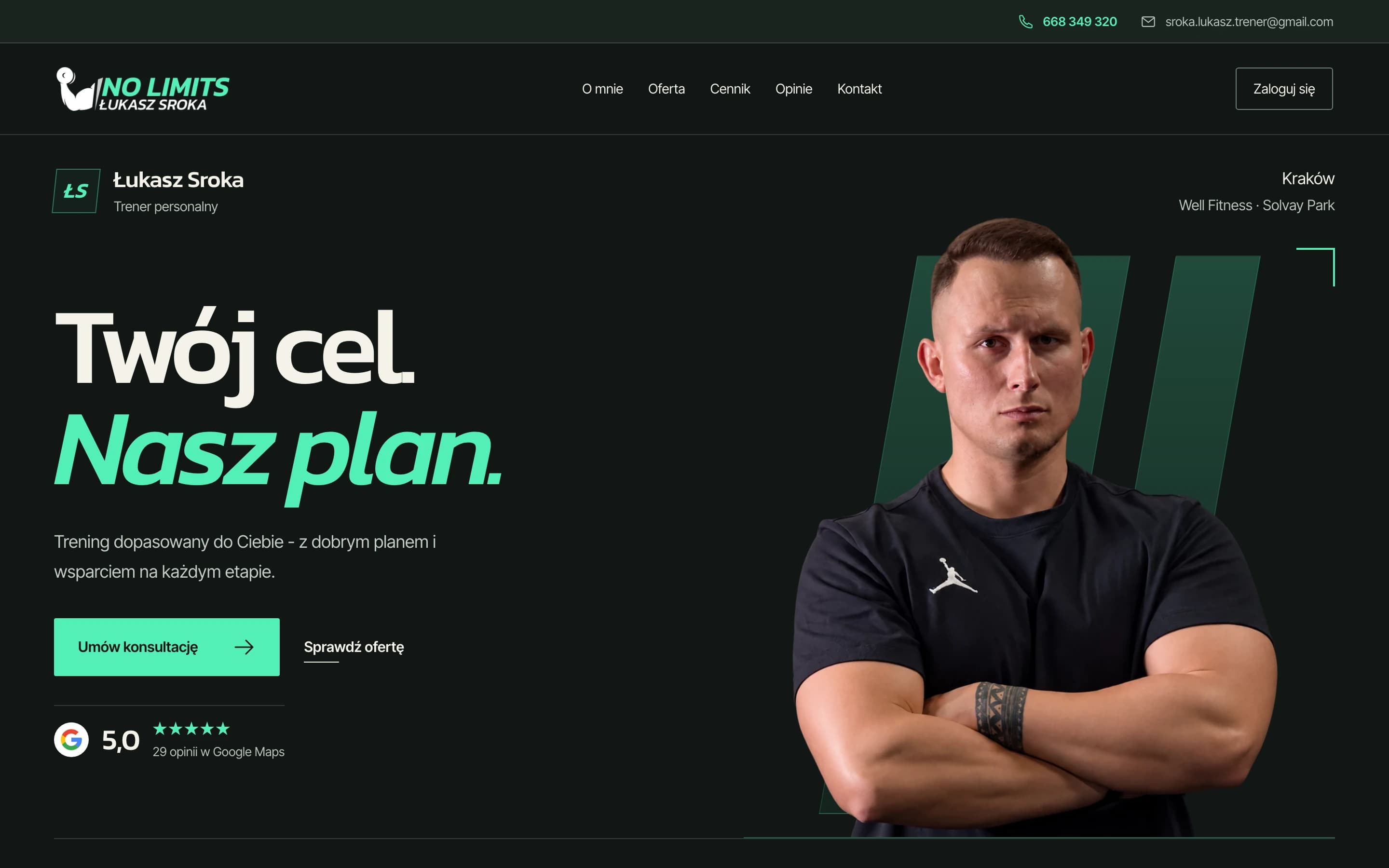
NO LIMITS homepage with a portrait of Łukasz Sroka and the headline Your goal. Our plan.
Landing: trainer photography, a concise coaching proposition, and a visible first step towards contact.
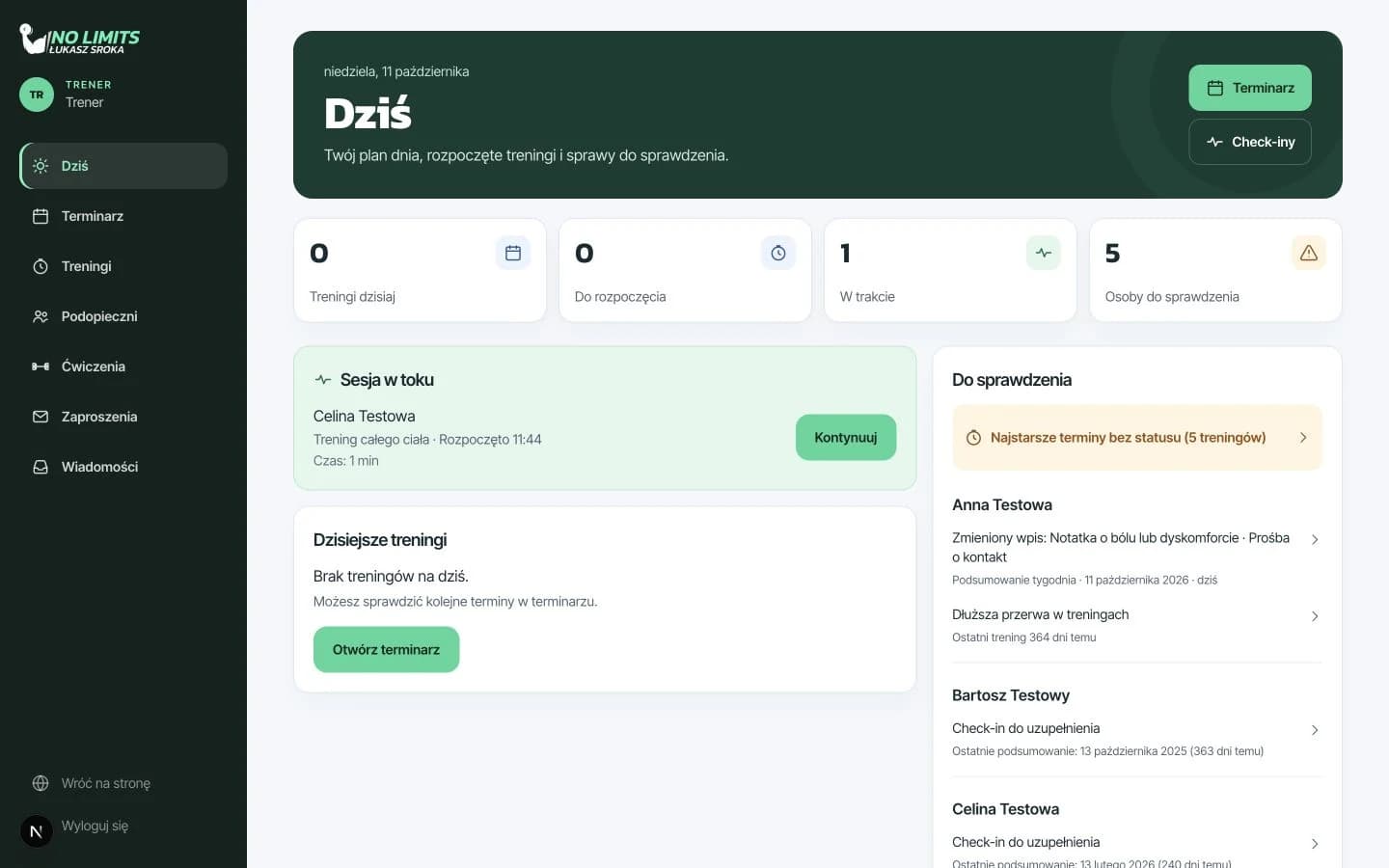
Trainer Today dashboard with the daily schedule and items to review, using test data
The trainer dashboard combines the daily schedule with items needing attention. Test data.
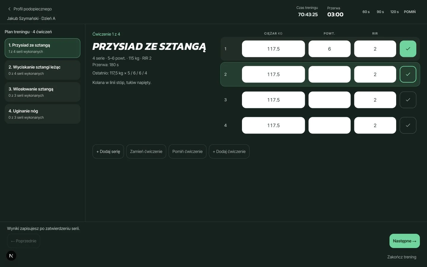
Active workout session with set logging by the trainer, using test data
From plan to practice: the trainer runs the session and records sets, repetitions, and load. Test data.
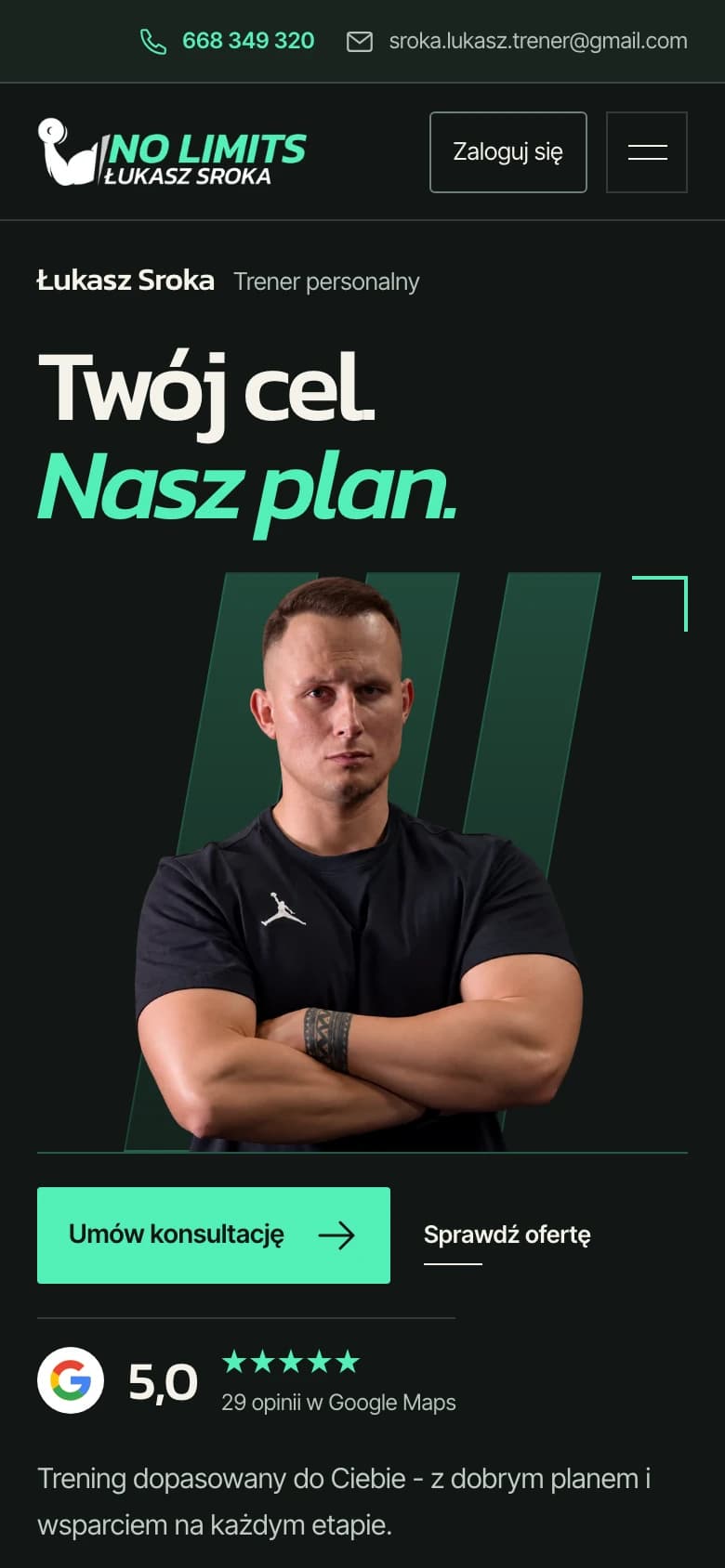
NO LIMITS mobile homepage

The mobile landing preserves the portrait, clear headline, and access to the offer.
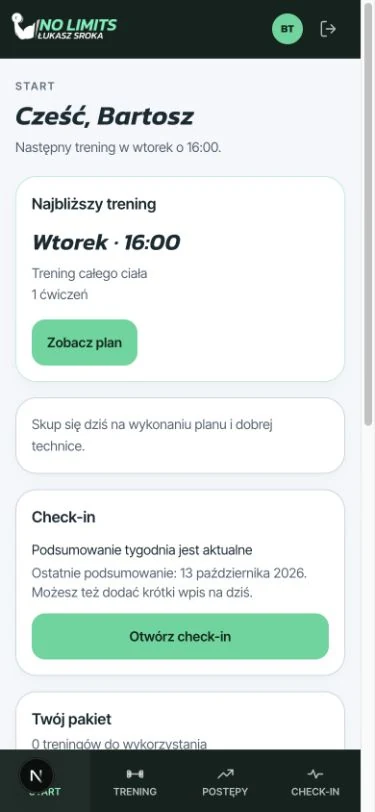
Mobile client dashboard with the next workout and check-in, using test data

Client dashboard: next appointment, plan, and check-in. Screen shown with test data.
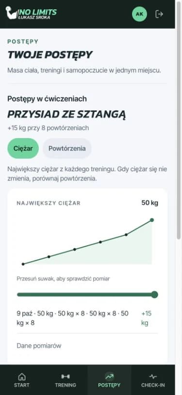
Mobile client progress view with results history, using test data

Strength progress and results history between sessions. Charts display test data.

From design to delivery

The public website and both roles run in one Next.js application. Supabase provides authentication and PostgreSQL, with data access checked on the server and through database policies.

  • Next.js + React + TypeScriptPublic pages, sign-in, and role-specific dashboards in one application; server actions handle data writes.
  • Supabase Auth + PostgreSQLInvitation-based accounts, trainer-client relationships, plans, appointments, sessions, check-ins, and package history.
  • Permissions and data integrityRLS policies, client-assignment checks, private notes, and transactional operations control access and keep changes consistent.
  • Shared interface systemColour and spacing tokens, Kanit and Inter Tight, responsive navigation, and loading, error, and empty states.
  • Local verificationDocumented unit tests, journeys on local Supabase, and responsive layout reviews.

What we delivered

  1. 01Landing and five supporting pages: About, Services, Pricing, Reviews, Contact
  2. 02Existing identity adapted for the website, sign-in, and app dashboards
  3. 03Trainer dashboard: Today view, clients, invitations, schedule, and exercise library
  4. 04Plan editing and coached sessions with set logging and results history
  5. 05Mobile client dashboard: plan, appointments, progress, and check-ins
  6. 06Check-in read acknowledgements and training package history
  7. 07Data model, access policies, and documented local test journeys

The key decision

The key decision was to treat the website and app as successive stages of the same relationship. The website explains the offer; the dashboards support the routine after the first conversation. A shared identity provides continuity, while different layouts and priorities let each role focus on its task.

Next projectHevelis - a precise identity for complex engineering

Brand identity and a bilingual website for aerospace and embedded systems consulting. A launch-trajectory hero, a clearly structured offer, and a direct path to a project conversation.
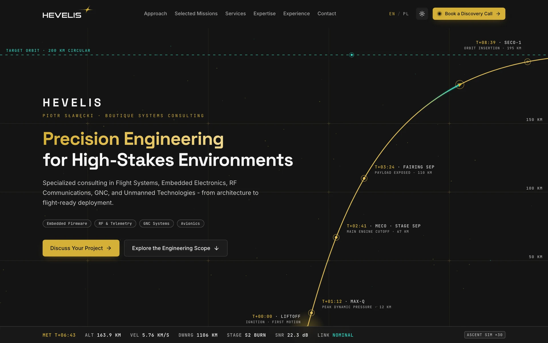
Hevelis - a precise identity for complex engineering
LET'S TALK

Let's talk about your project

Should your website be the start of a longer client relationship? Let’s connect it to a tool for everyday work.