Gold
#D4AF37
Accent and calls to action
It draws attention to key elements without overpowering the content.
Technology studio · Web apps, websites & marketing
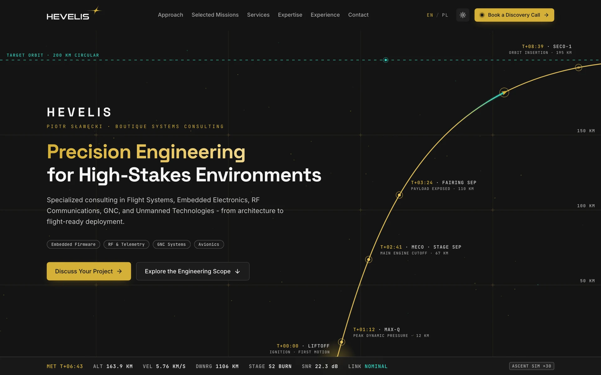
Brand identity and a bilingual website for aerospace and embedded systems consulting. A launch-trajectory hero, a clearly structured offer, and a direct path to a project conversation.
Project at a glance
Hevelis is Piotr Sławęcki’s independent engineering practice in Kraków, working across systems architecture, embedded electronics, RF communications, and control systems. We created an identity and a PL/EN website that turns a complex offer into clear areas of support, representative engineering scopes, and a project inquiry form.
Context & problem
Hevelis is Piotr Sławęcki’s independent engineering practice. The site brings together work in systems architecture, embedded electronics, and flight systems, then guides visitors from understanding the offer to getting in touch.
The offer covers work that is hard to explain with one broad slogan. A technical team needs to see quickly whether the consulting fits its product, where support can help, and what an engagement involves.
We shaped the brand and site to make that work tangible. Instead of rocket stock photos and broad promises, the page uses a clear hierarchy, examples of engineering scope, and a restrained visual language inspired by instrumentation.
The site is available in English and Polish. It separates the approach, services, capabilities, and experience, while the contact section lets a visitor describe a project, its constraints, and its timeline.
Constraints
Strategic principles
The identity and copy present Hevelis as Piotr Sławęcki’s hands-on engineering practice.
Gold accents, a trajectory chart, and small data readouts suggest a precise working environment without pretending to be a real control panel.
Visitors can follow the work from framing the problem through to preparing a solution for deployment.
Service descriptions and representative scopes show the kinds of problems Hevelis can help solve.
Visible contact prompts and a form that asks for project context shorten the path from interest to inquiry.
Creative direction
The identity combines technical precision with a sense of direction. A gold four-point mark beside the wordmark, a trajectory chart, and restrained typography create a distinctive motif that carries through the page to the contact step.
Brand character
Tone of voice
Calm and specific. The copy explains problems, scope, and ways of working in plain language, keeping specialist terms where they add useful detail.
What we deliberately avoided
Logo story
A gold, four-point signal mark sits beside the HEVELIS wordmark. Its simple geometric form makes a navigation reference and stays legible in the header.

The gold four-point symbol is the graphic mark beside the HEVELIS name.
The mark has a navigation-signal quality that complements the trajectory chart on the site.
A straightforward uppercase wordmark keeps a technical character without extra ornament.
The signal mark and wordmark appear together in the header. Strong contrast helps them stay legible on light and dark backgrounds.
Colour system
Warm gold highlights key actions and parts of the chart. Teal marks supporting elements, while cool backgrounds keep the interface calm and technical.
#D4AF37
Accent and calls to action
It draws attention to key elements without overpowering the content.
#2DD4BF
Supporting accent and data
It separates supporting information from gold buttons and headings.
#0B132B
Text on light backgrounds
Its deep tone creates clear contrast against light surfaces.
#F1F3F6
Light theme surfaces
A cool, softened white gives the content room to breathe.
#141414
Dark theme surfaces
Neutral black lets light type and gold details stand out.
Typography
Geometric headings, neutral body text, and a monospace face for technical labels create a clear hierarchy.
500 · 700
Headings and brand name
Precision Engineering
Geometric letterforms give the interface a contemporary technical character.
400 · 500
Body text and form
Specialized consulting in flight systems and embedded electronics
A neutral face helps visitors scan longer descriptions and form fields.
500 · 600
Labels and technical readouts
MISSION · SYSTEMS · DEPLOYMENT
Monospaced lettering distinguishes short labels and values from descriptive copy.
User flow
The page moves from a concise introduction through services and experience to a project inquiry form.
The headline, introduction, and trajectory chart establish Hevelis’s field of work at a glance.
The Engineering Scope section lays out the stages of work and the questions that shape a project.
Service cards cover topics from systems architecture to embedded electronics, RF, and GNC.
The experience section introduces Piotr Sławęcki, his background, and working principles.
The form asks for project type, estimated timeline, and a description, with direct contact details alongside it.
UX/UI decisions
Key interface sections
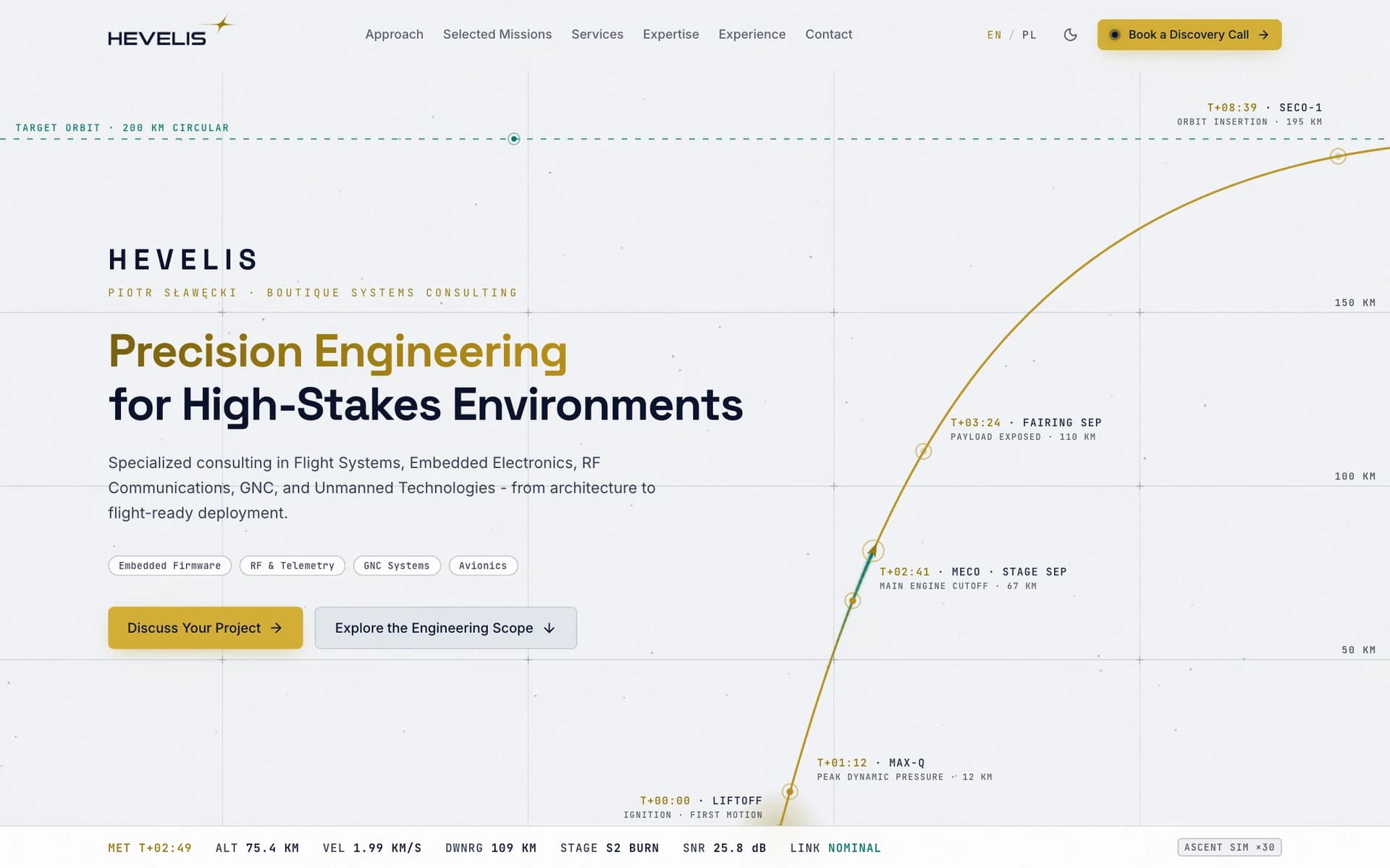
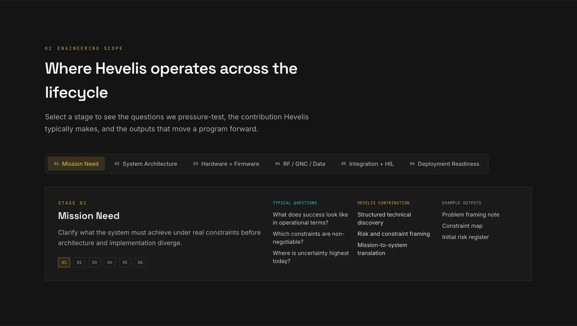
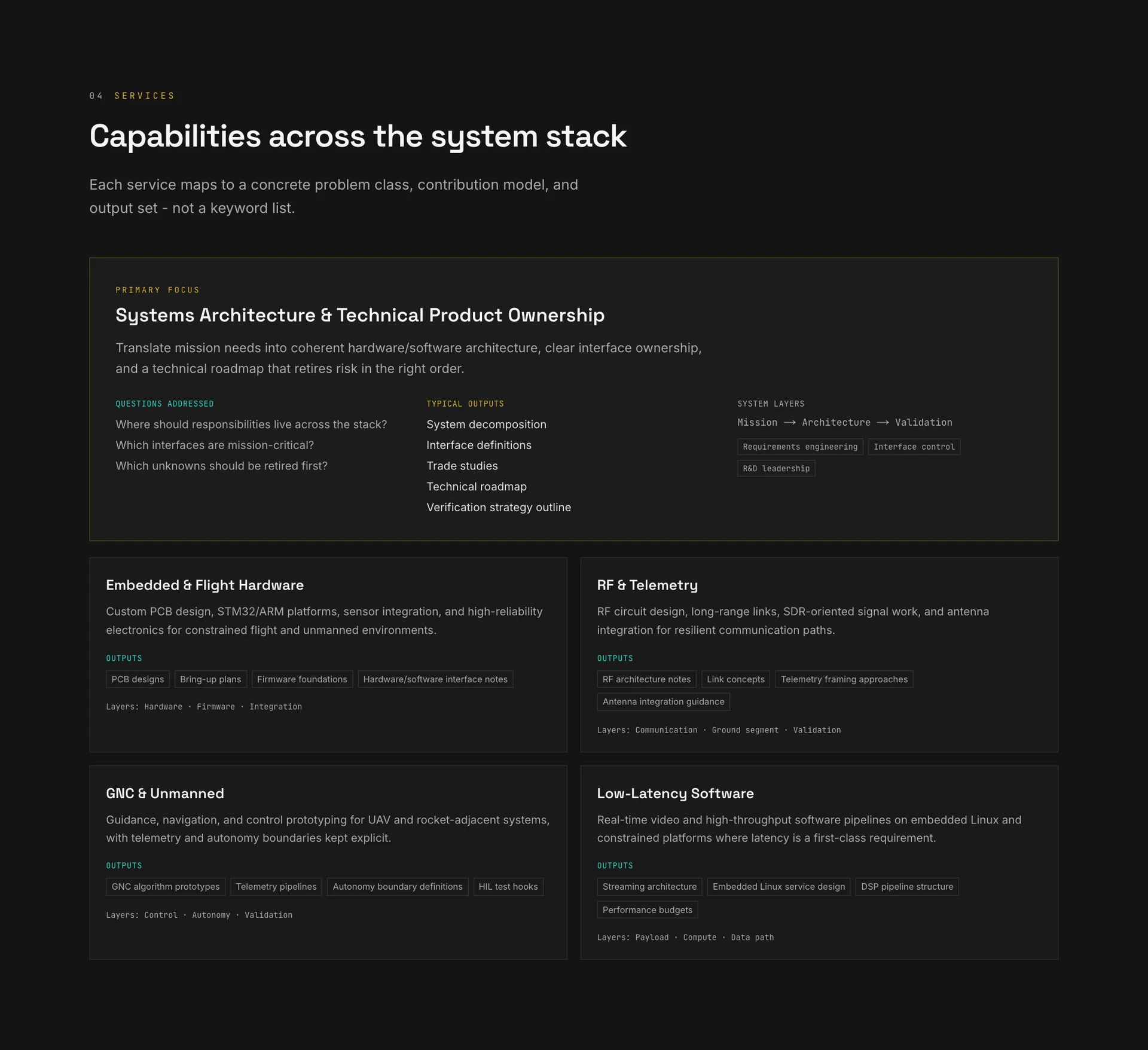
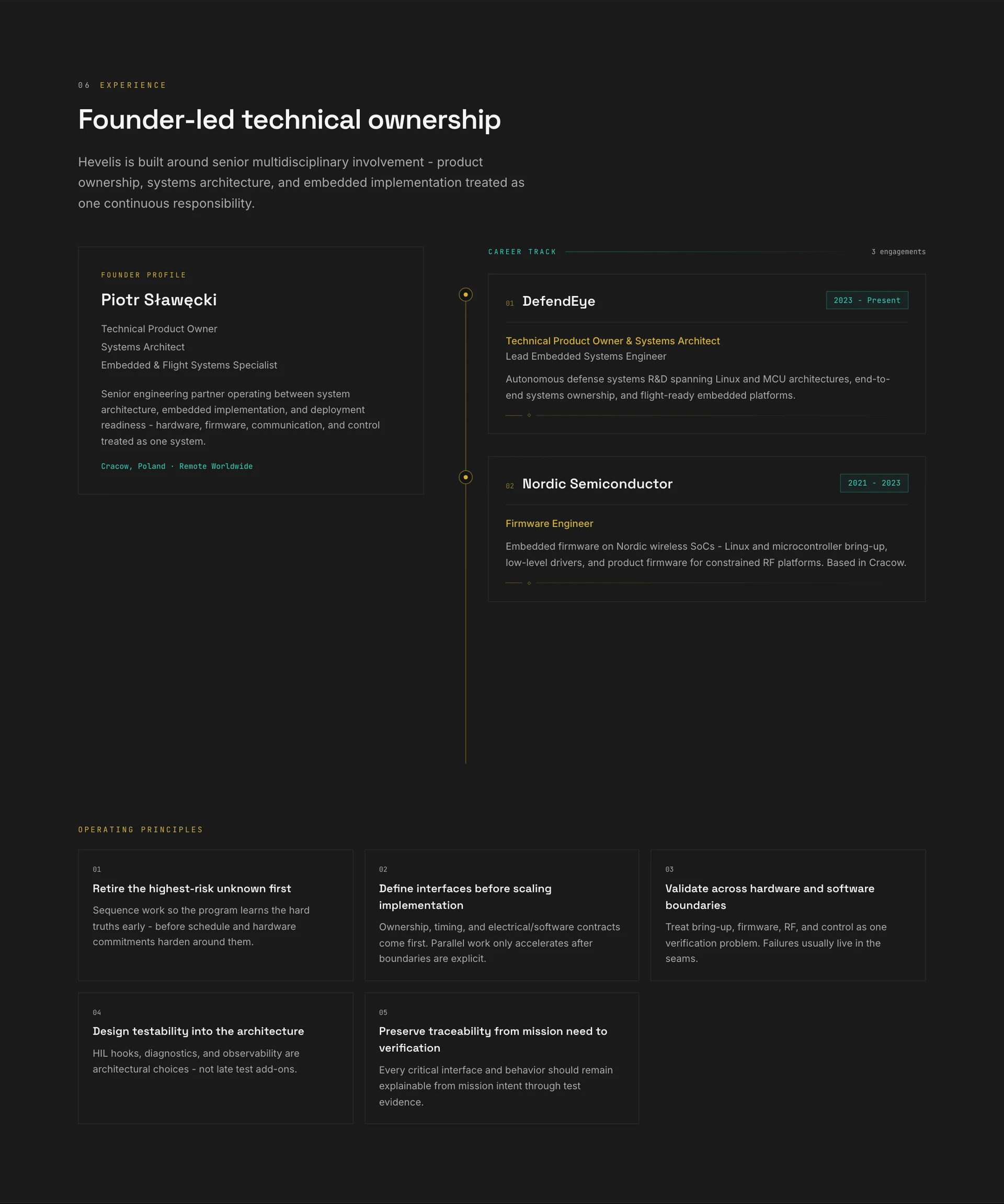
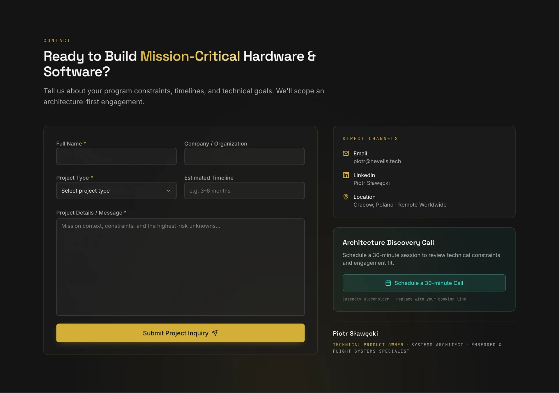
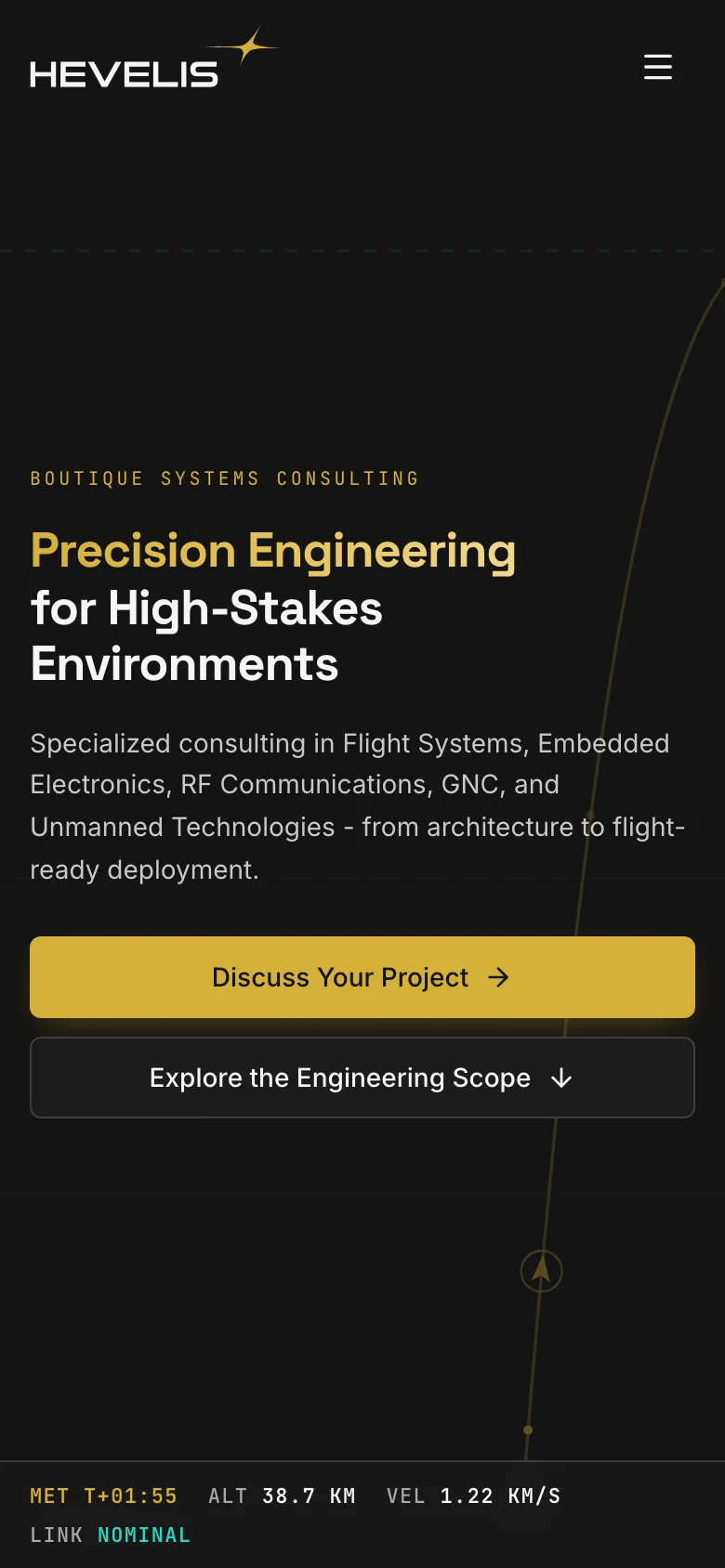
The mobile layout keeps the headline and chart legible while keeping contact within reach.
From design to delivery
The site combines a Next.js application, editable content, and Netlify hosting.
What we delivered
The key decision
The strongest result is the clear path from introduction through approach to services. The trajectory chart gives the brand a distinct character, while specific descriptions, the founder profile, and a straightforward form help visitors decide whether to start a project conversation.
Live site
Hevelis · Piotr Sławęcki
From the W mark to the parts catalogue: identity, website, and storytelling for a studio creating 3D-printed automotive solutions. Dark surfaces, a yellow accent, and real garage photography.
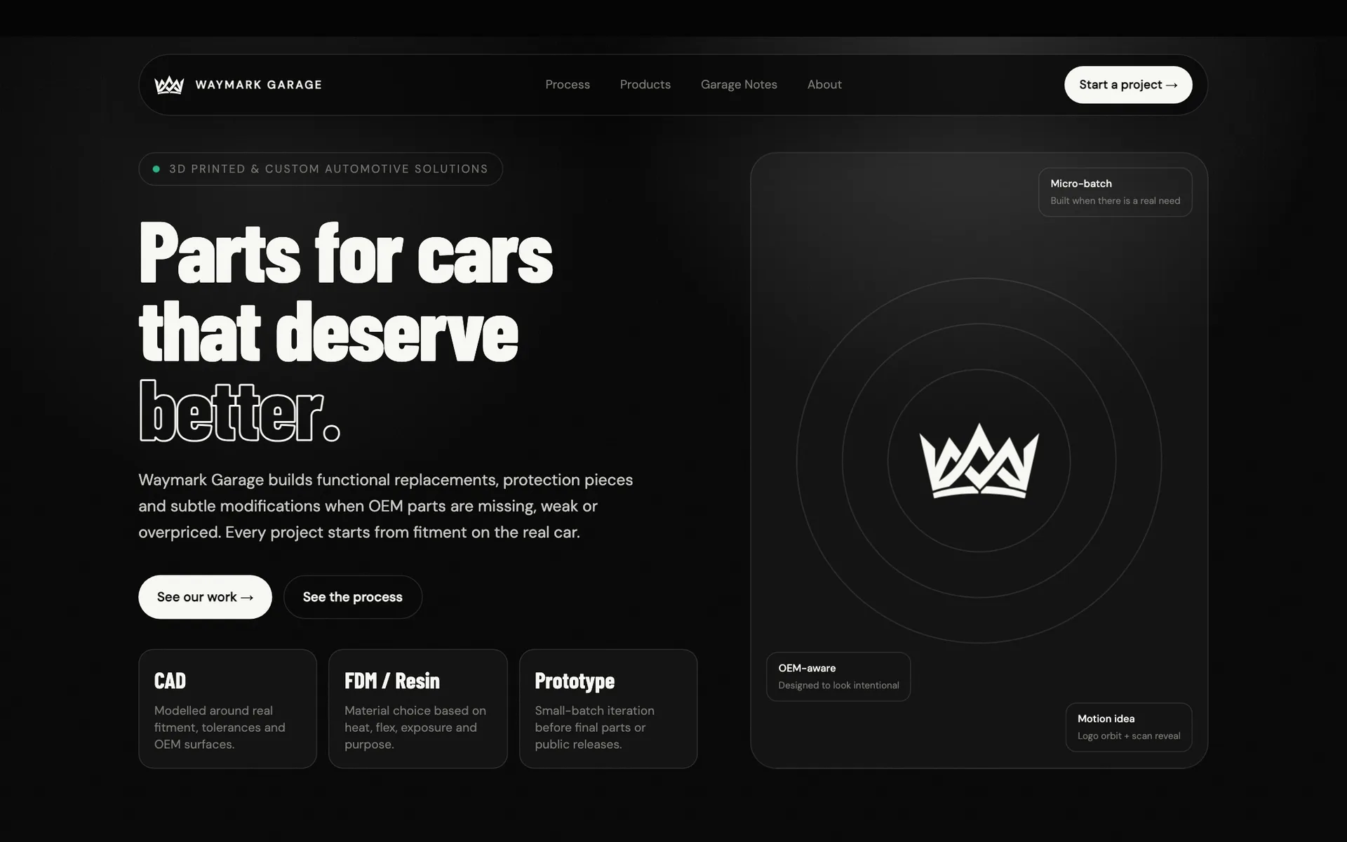
Need a distinctive brand and website? Code & Visuals can design and build them as one coherent experience.