Warm black
#0B0A07
Site background
Connects photography and text sections into a continuous visual backdrop.
Technology studio · Web apps, websites & marketing
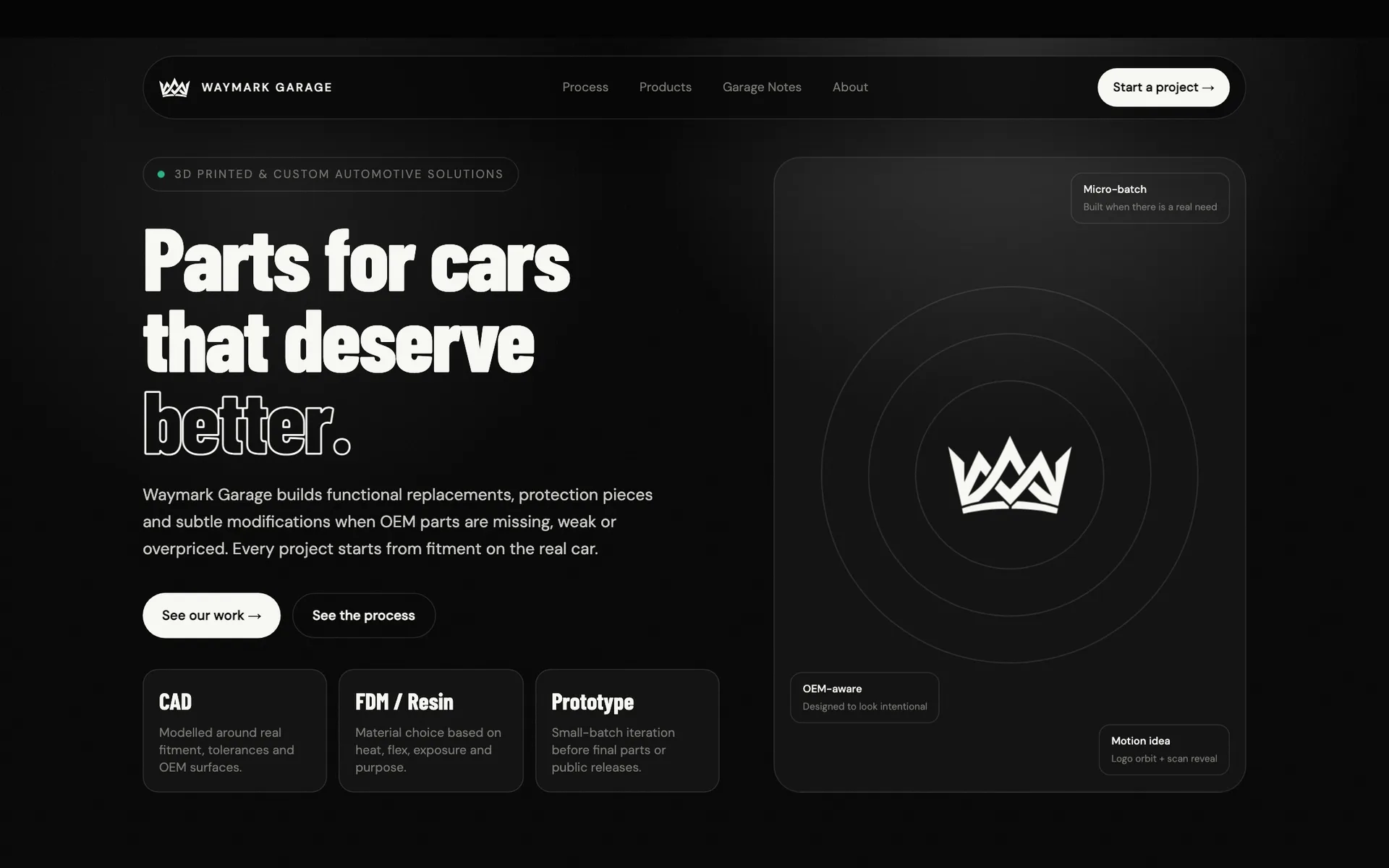
From the W mark to the parts catalogue: identity, website, and storytelling for a studio creating 3D-printed automotive solutions. Dark surfaces, a yellow accent, and real garage photography.
Project at a glance
Waymark Garage makes replacements, protection pieces, and small modifications when OEM parts are missing, weak, or overpriced. We built its brand and website around one principle: fitment on the real car. The site presents the process, two parts for the Honda Civic Type R FL5, and Garage Notes documenting product development.
Context & problem
Small parts can solve a real problem. Waymark Garage designs and prints automotive components when the factory solution is unavailable, expensive or needs improvement. The project brought the brand identity and website together around the part, its purpose and the work behind it.
Fitment on a specific car was the starting point. A customer needs to know whether a part fits, what it is made from and how it mounts. The site had to answer those questions while expressing the brand’s automotive character.
The current catalogue centres on two Honda Civic Type R FL5 products: fender rock guards and a MagSafe charger mount. Photography, WGM-001 and WGM-002 identifiers, and dedicated product pages give the offer a concrete structure.
The site leads from recognising a problem through the process and project documentation to a short brief. That journey accommodates both available small-batch parts and inquiries about custom projects.
Constraints
Strategic principles
The offer is organised by use: replacements, protection pieces, functional modifications and CAD prototyping. Technology appears in the context of a specific need.
Installed-part photography, named materials and specifications show what the customer gets. Each product page connects that information to its development story.
The process page and Garage Notes explain the work: measuring, modelling, test prints and revisions after fitting.
The recurring “Ask for a part” call to action leads to a form with space for the car, part or idea and a description of the problem.
Creative direction
Waymark Garage is built around attention to the small parts of a car. “Small parts. Important details. For cars we love.” connects practical purpose with enthusiasm for cars. Dark surfaces, large type and automotive photography set the mood; product images bring the story back to the actual work.
Brand character
Tone of voice
The language is direct and specific. Descriptions cover the vehicle, mounting, material and intended use. Short headlines give the brand energy; longer copy helps a visitor assess the product before getting in touch.
What we deliberately avoided
Logo story
A geometric “W” forms a compact mark from sharp, directional shapes. It echoes the name Waymark, a point of orientation, and fits the brand’s technical character. The standalone symbol keeps the identity recognisable where the full wordmark would take too much room.

The letter “W” connects the symbol directly to the brand name.
The pointed ends recall arrows and route markers.
Repeated angles and a clear outline reinforce the technical character of the identity.
The monochrome form works on light and dark backgrounds. The symbol and full wordmark provide two options for different proportions and sizes.
Colour system
Warm black and off-white form the foundation of the current site. Yellow highlights buttons and selected details, guiding the eye through the dark, photographic layout.
#0B0A07
Site background
Connects photography and text sections into a continuous visual backdrop.
#F7F7F2
Headings and primary content
Gives text a clear contrast against dark surfaces.
#FFC400
Buttons and highlights
Identifies key actions, including “Ask for a part” and product inquiries.
#7A7A75
Labels and metadata
Separates information levels without expanding the palette.
Typography
Barlow Condensed gives headlines strength and compactness. DM Sans carries descriptions, forms and specifications.
700 · 800
Headings and display copy
Small parts. Important details.
Condensed proportions make room for large, compact blocks of text alongside photography.
300 · 400 · 500
Descriptions and technical information
Modelled around real fitment, tolerances and OEM surfaces.
A neutral design provides a quiet foundation for longer descriptions and product specifications.
User flow
The home page establishes context, while dedicated pages provide depth. Visitors can go straight to a product or first explore how the workshop works.
The hero combines the brand headline, car photography and a link to a specific product.
Four “What we solve” categories help visitors relate their own problem to the offer.
Four workflow stages run from understanding the problem to refining the part before release.
The catalogue leads to photography, specifications, mounting information and the product story. Garage Notes add further documentation.
The form collects contact details, the car, part or idea, and a description of the problem.
UX/UI decisions
Key interface sections
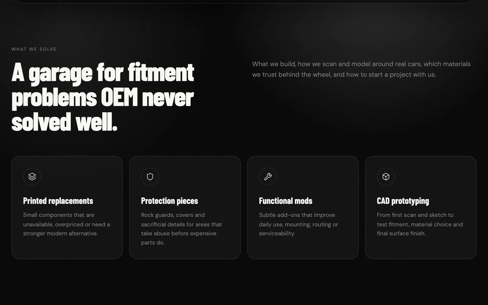
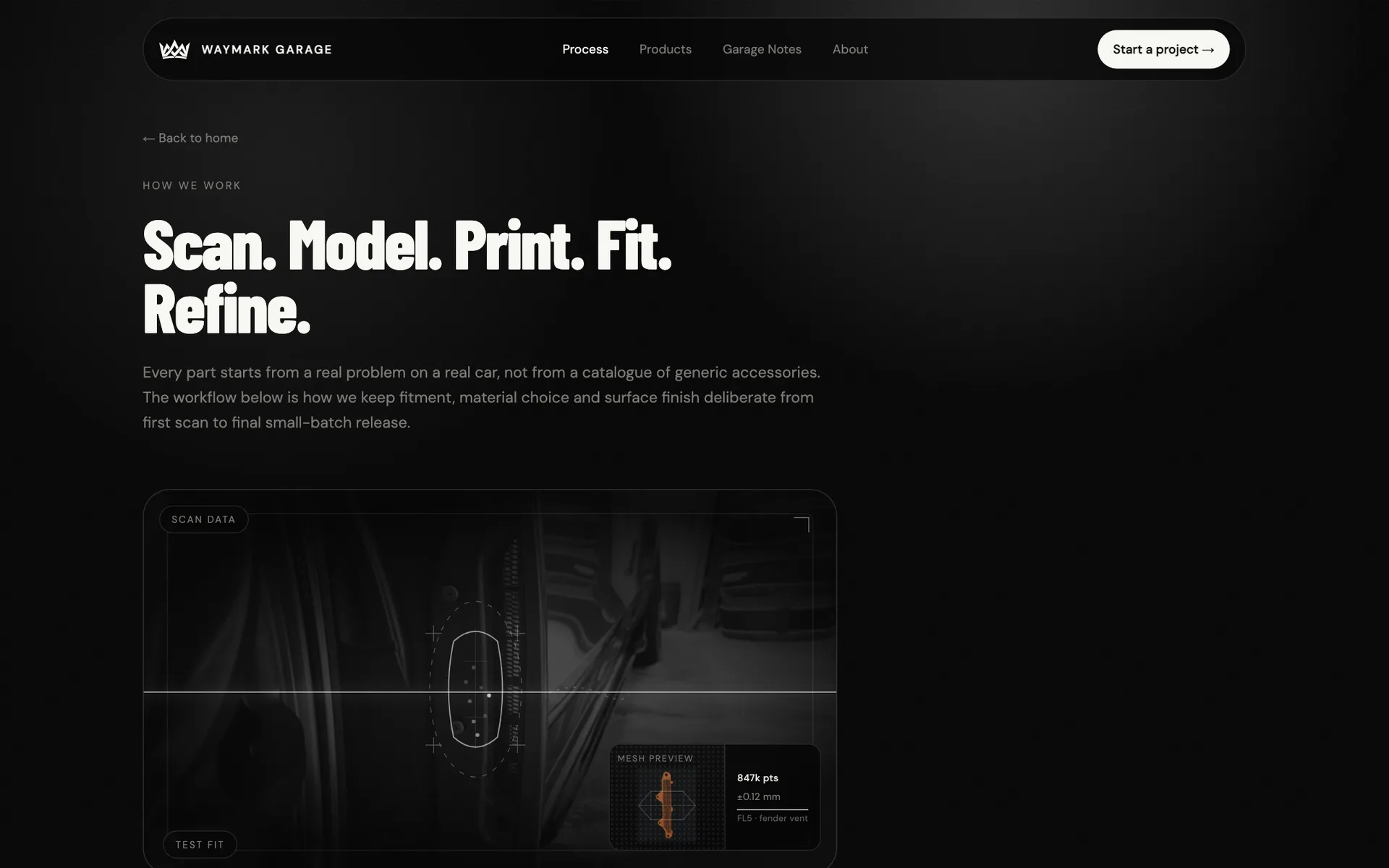
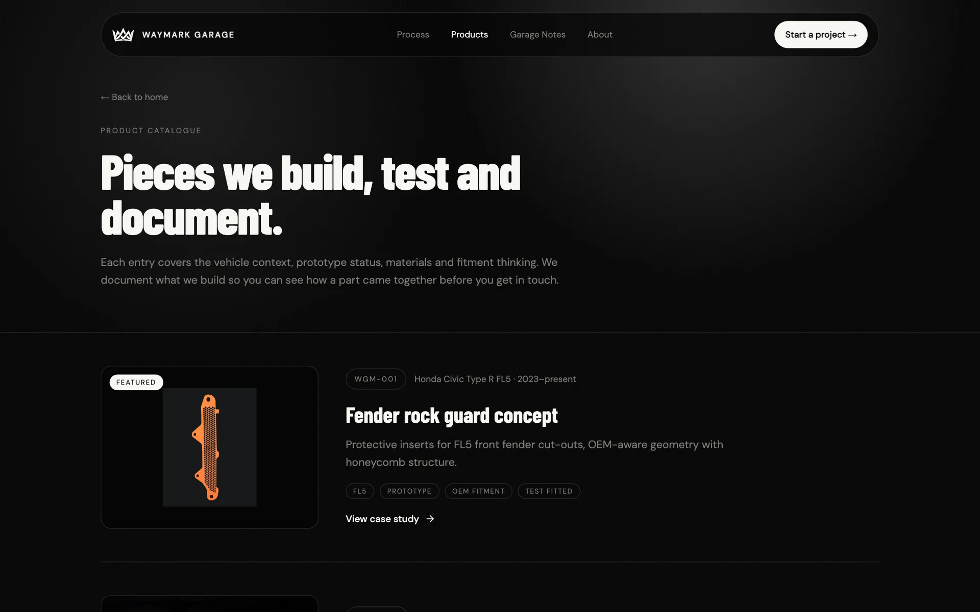
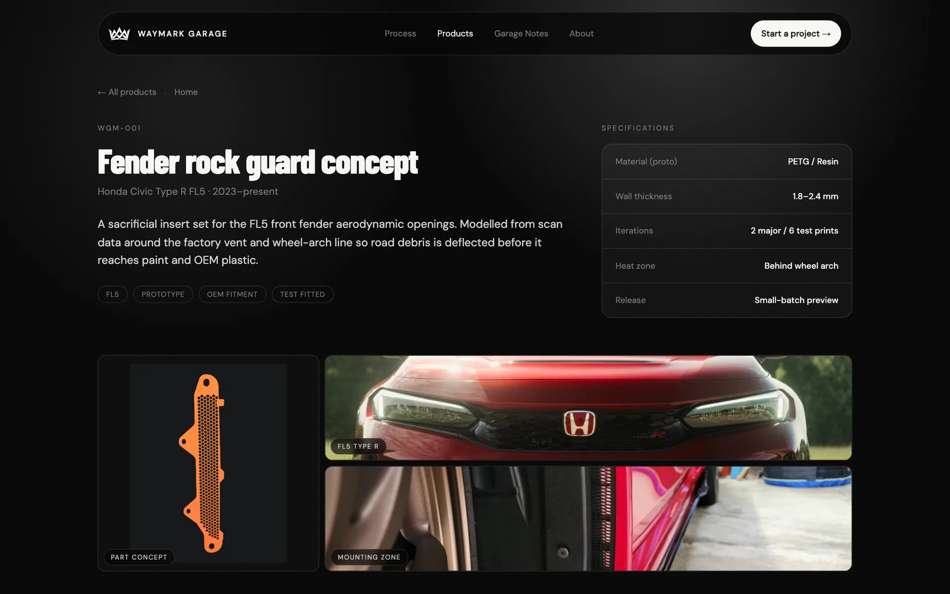
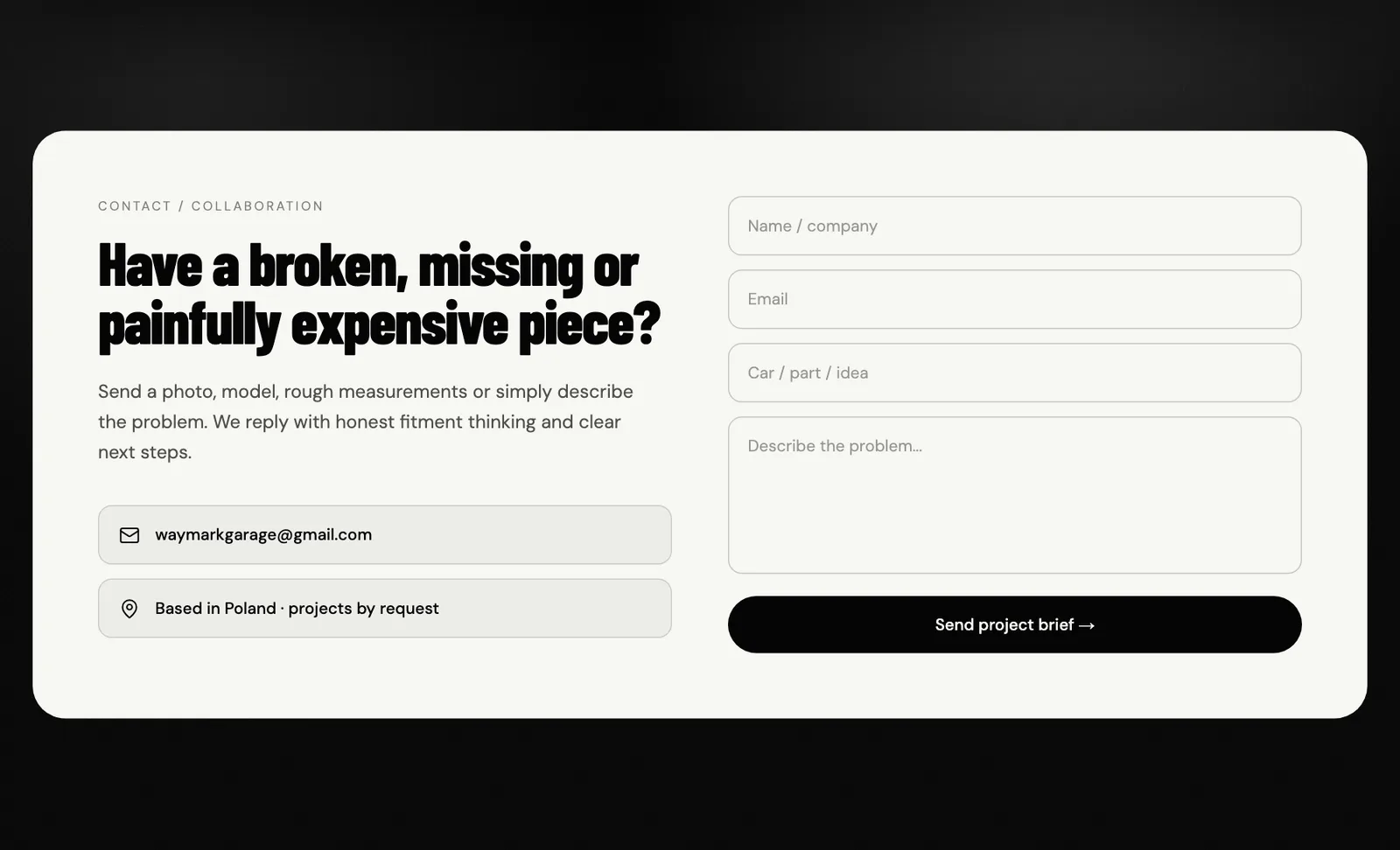
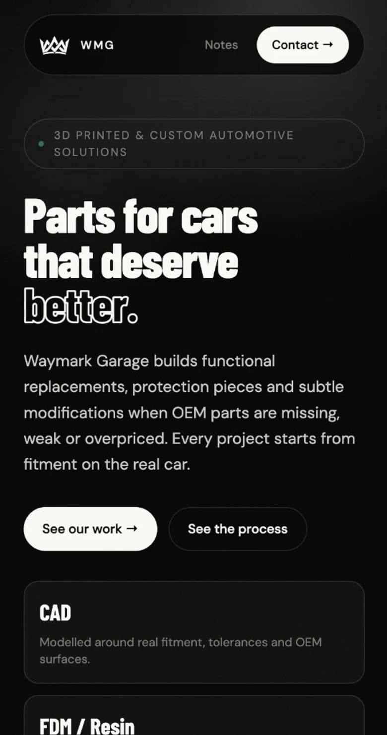
The mobile layout retains the large headline and a clear route to the offer.
From design to delivery
The site structure supports a growing catalogue: products, the process and notes have dedicated pages, while shared navigation leads to an inquiry.
What we delivered
The key decision
The strongest part of this story is specific: a part, a car and the problem addressed by the product design. The identity gives them a shared character, while the site structure leads from interest into detail. The result is a coherent brand website with a two-product catalogue and a clear path to an inquiry about the next part.
Live site
Waymark Garage
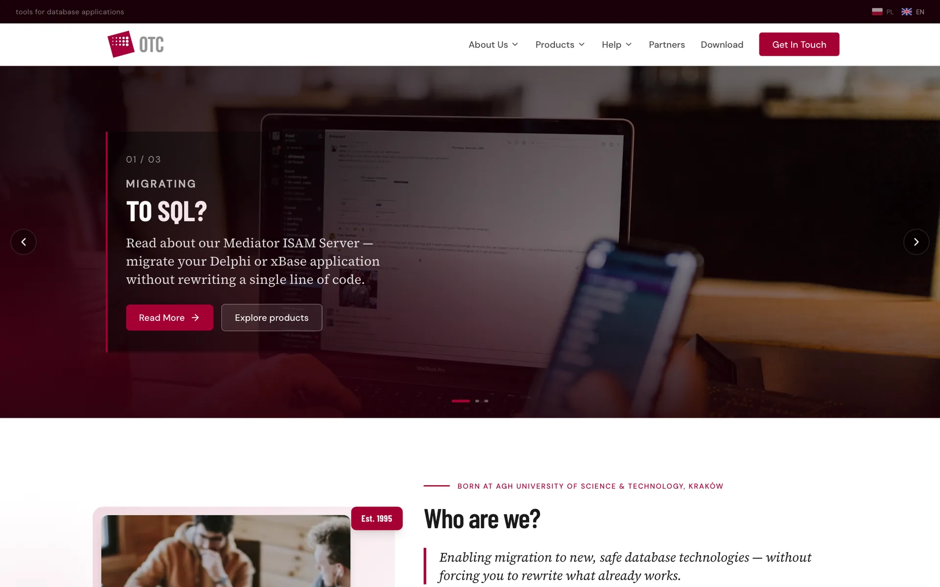
Modernising the heavily outdated website of a Polish software company - a clean, conversion-focused site presenting their database products.
Have a technical offer that deserves a clearer presentation? Let’s talk about your project.