← Back to portfolio
RedesignUX/UIWeb designDevelopmentOTC S.A.2026

OTC S.A. - website redesign for a software company

Modernising the heavily outdated website of a Polish software company - a clean, conversion-focused site presenting their database products.

  • Audit of the current site
  • Information architecture
  • UI/UX redesign
  • Website design and build
  • PL/EN bilingual version
  • Conversion optimisation
OTC S.A. - website redesign for a software company

Project at a glance

OTC S.A. is a Kraków company operating since 1995, building tools for migration and work with relational databases (Mediator, Terminal, Winflector). Their previous website belonged to a different internet era - cluttered, hard to navigate, and out of step with the quality of the software itself. We designed a modern, well-structured site that builds credibility and drives contact.

Client
OTC S.A.
Year
2026
Industry
IT · database tooling
Platform
Bilingual PL/EN company site (React SPA)
Audience
Delphi/xBase developers, existing enterprise clients, and partners
Project goal
Modernise the site without losing brand recognition or decades of product content
Status
New site deployed and ready to take over the otc.pl domain
Category
Redesign · UX/UI · Web design · Development

Live site ↗

Context & problem

OTC S.A. is a Kraków technology company founded in 1995 by staff of the IT and Telecommunications Department at the AGH University of Science and Technology. For three decades it has been developing tools for relational databases - Mediator, Terminal, and Winflector - used by enterprise clients worldwide.

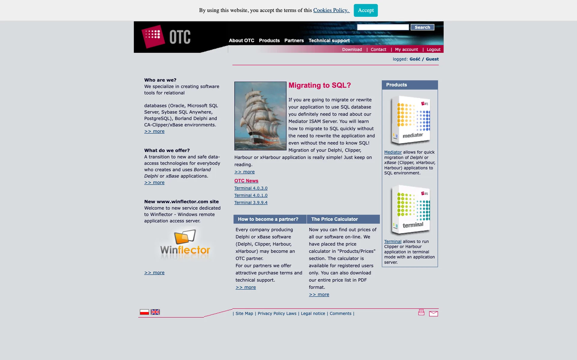
The company’s previous website was built to the standards of an earlier web generation: a table-based layout fixed at 773 pixels, hover-triggered dropdown menus, and URLs like index.asp?s=21&l=2. When it was created it was a correct, complete site - but it no longer matched today’s devices or browsing habits: it had no mobile version, and navigating it required knowing the site’s structure.

The problem was not the content - that was rich and substantive: product descriptions, technical topics, an FAQ, version histories, departmental contact details. The problem was its presentation. A new client judging the company by its website could come away with an impression of datedness that did not remotely match the quality of the software itself.

The site serves two different groups: existing clients returning for versions, support, and documentation - and new ones still assessing the vendor’s credibility. The redesign had to serve both without losing anything along the way.

Constraints

  • Preserving decades of product content - documentation, FAQ, and version histories
  • Recognisability of the existing brand - the logo, the crimson, and product language stay
  • Full Polish and English versions from day one
  • The company’s technical character - no marketing overstatement
  • Existing clients must still find the information they know

Strategic principles

  1. 01

    Modernisation, not rebranding

    The goal was not a new brand but a contemporary way of using the existing one. The OTC crimson, the logo, and the product slogans ("The only way is SQL!") were kept and given a new setting.

  2. 02

    Three product lines as the site’s axis

    Mediator, Terminal, and Winflector are the three reasons anyone visits otc.pl. The navigation, home page, and subpages are built around that split.

  3. 03

    The company’s track record as an asset

    The 1995 founding, the AGH origin, and the licence numbers could not stay buried in "About us" - they moved to the home page as proof of credibility.

  4. 04

    Technical content must be scannable

    Long descriptive pages became topic lists, tabs, and cards - a developer looks for a specific issue, they do not read a site like a book.

  5. 05

    First-class bilingualism

    Nearly half of the company’s revenue comes from export, so the PL and EN versions must be equals - with a switcher available instantly, without a page reload.

Colour system

The goal was not a rebrand but a modernised use of the existing identity. The historic crimson remains the heart of the palette - what changed is its role: from decoration to a controlled accent.

OTC crimson

#A50034

System accent - CTAs, active elements, key information

A continuation of the brand’s historic crimson in a deeper, contemporary tone. It works as a controlled accent guiding the eye to actions - not as a colour dominating the whole interface.
Ink

#111827

Headings and body text

A neutral, confident base for technical content - product names, versions, and specifications read effortlessly on light backgrounds.

Warm white

#F6F5F3

Section and card backgrounds

A light site inverts the dense composition of the old one - long product content gains air and light. The slightly warm white separates sections without rules.

Orange accent

#E85D04

Informational highlights - news categories, labels

A second, warmer accent separates informational elements from actions - crimson always means "click", orange means "take note".

Grey

#6B7280

Metadata - dates, secondary copy, captions

A neutral grey builds hierarchy in data-dense views - versions and publish dates are present but never compete with primary content.

Typography

Neutral, precise typography supports reading technical information - with one editorial accent nodding to the company’s 30-year history.

Barlow Condensed

600 · 700

Headings and headlines

Migrating to SQL?

A condensed display face organises dense product pages - strong headings ("MIGRATING TO SQL?") mark out sections without stealing space from content.

DM Sans

400 · 500

Body text and interface

Mediator ISAM Server - fast, unproblematic migration from DBF to SQL.

A neutral, highly readable grotesque - precise around product names, version numbers, and technical topic lists.

Source Serif 4

400 · 600

Editorial accents

Founded in 1995 at the AGH University of Science and Technology in Kraków.

A serif accent for leads and company passages adds a documentary character - fitting for a vendor operating since 1995.

User flow

The old site treated all content as equal - three teaser columns of similar weight. The new architecture arranges it into a single, prioritised path.

  1. 01

    Quickly understanding the company profile

    A hero with the SQL-migration message and a stats band: founded 1995, 30+ years of expertise, three product lines.

  2. 02

    Choosing the right product line

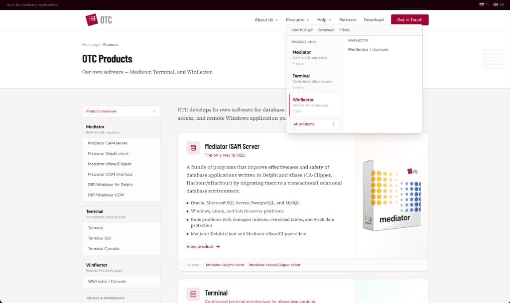
    The "Products" mega-menu and Mediator / Terminal / Winflector tabs on the home page - the split visitors actually come for.

  3. 03

    Drilling into product details

    Readable URLs (/products/mediator/delphi) and technical topic lists - WAN operation, migration costs, Terminal interoperability.

  4. 04

    Learning about OTC’s experience and credibility

    The "Who are we?" section with the story since 1995, licences sold, and dated product news - evidence instead of claims.

  5. 05

    Contact for implementation, purchase, or support

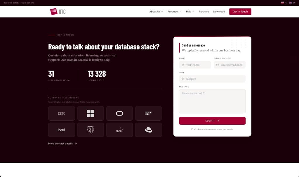
    A form with a message topic right on the home page, plus departmental e-mails spelled out: office, support, orders.

UX/UI decisions

01
Problem
Multi-level, text-heavy hover navigation lost users and did not work on touch.
Decision
We replaced it with a simpler split by product line - the "Products" mega-menu groups the Mediator, Terminal, and Winflector families in one view.
Rationale
Visitors come for a specific product - the sooner they see it, the less likely they are to get lost.
Impact
Faster access to Mediator, Terminal, or Winflector information - touch devices included.
02
Problem
URLs like index.asp?s=21&l=2 were unreadable and impossible to remember.
Decision
A new structure of readable URLs mirroring the content hierarchy: /products/mediator/delphi, /support/faq, /products/prices.
Rationale
A readable URL is part of the navigation - it can be understood, saved, and sent to a colleague.
Impact
A linkable, understandable content map instead of numeric parameters.
03
Problem
The fixed 773 px layout was unreadable on phones - it required zooming and side-scrolling.
Decision
A fully responsive layout: the card-and-tab grid reorganises from wide desktop down to a narrow phone screen.
Rationale
Technical documentation gets looked up on phones too - during an on-site implementation, for example.
Impact
Full access to product content on any device, no pinch-zooming.
04
Problem
Contact was a plain-text business card - an address and phone numbers with no path to action.
Decision
A form with a topic field on the home page, a confidentiality note, and departmental e-mails spelled out (office, support, orders).
Rationale
A client with a technical question and one with a purchase inquiry need different recipients - the split shortens the path for both.
Impact
A shorter path to contact and the right recipient from the first message.
05
Problem
Language switching happened via footer flags and reloaded the whole page.
Decision
A PL/EN switcher in the header - instant, remembering the user’s choice between visits.
Rationale
Nearly half the company’s revenue is export - the English version cannot be a hidden add-on.
Impact
A language change without losing your place on the page and without a reload.
06
Problem
Years of support content (FAQ, versions, problem reports) risked getting lost in the redesign.
Decision
A dedicated support section with the FAQ grouped by product, version histories, and a structured problem-report form (product, version, environment, severity).
Rationale
Existing clients return to the site precisely for this information - losing it would be a regression, not modernisation.
Impact
Continuity of access to technical knowledge in a new, clearer structure.

Key interface sections

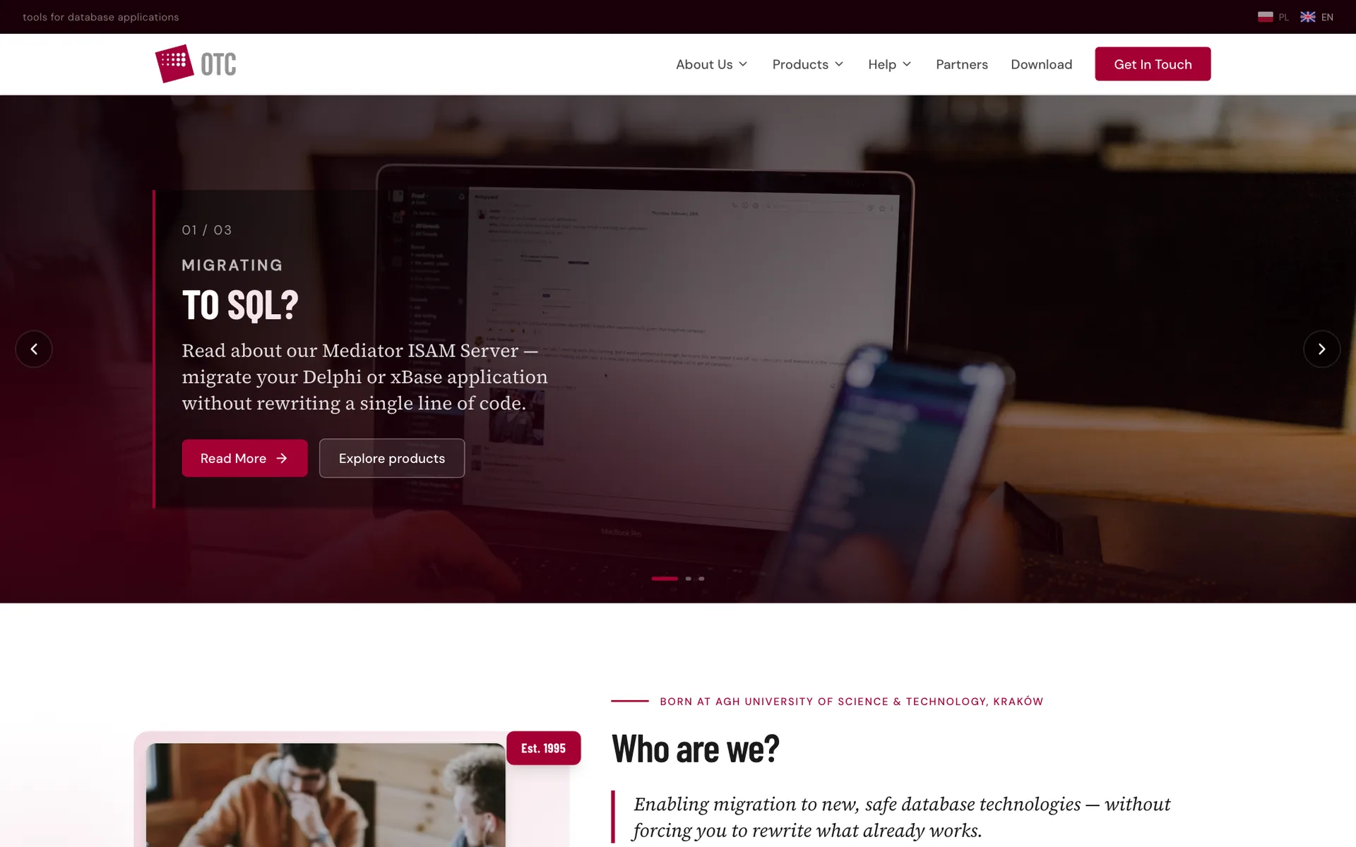
The new OTC home page - a hero with "Migrating to SQL?" and a stats band
The new home page: the SQL-migration message carried over from the old site but delivered in a contemporary way - with the company’s numbers right under the hero.
The Mediator / Terminal / Winflector product tabs
The product tabs: three lines in one view, with a technical topic list instead of a long wall of text.
The contact section with the form and company numbers
Contact with a form and message topic - next to trust-building numbers and departmental e-mails.
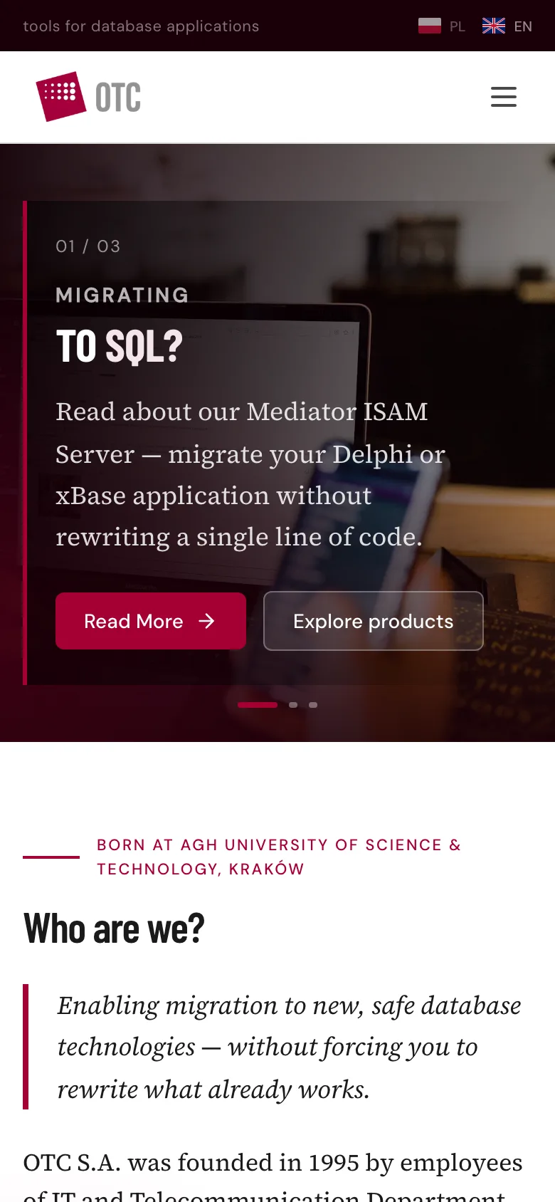
The new OTC site on a phone

The mobile version of the new site - product content in a single column, no zooming required.

Before & after

The previous OTC site was a solution built to the standards of an earlier web generation - complete and substantive, but designed for pre-mobile monitors and browsers. The comparison shows how the same content was translated into a contemporary site.

Before - otc.pl

The previous OTC site - a table-based layout fixed at 773 px

After - the new site

The new OTC site - a responsive, light layout with clear hierarchy
-BeforeAfter
Layout & responsivenessA fixed 773 px table-based layout with no mobile versionA responsive grid adapting to every screen
NavigationHover-triggered menus and numeric URLs (index.asp?s=21&l=2)A product-line split and readable URLs (/products/mediator)
Content hierarchyThree teaser columns of similar visual weightOne axis: company profile → products → credibility → contact
Product presentationLong text pages read top to bottomProduct tabs and scannable technical topic lists
Language versionsFooter flags reloading the whole pageAn instant PL/EN header switcher that remembers the choice
ContactA plain-text card - address and phones, no formA form with a message topic plus departmental e-mails
Visual identityThe brand crimson baked into sliced GIF graphicsCrimson as a system accent - CTAs and active elements

What we kept

  • The full Mediator, Terminal, and Winflector product content
  • The historic crimson and the company logo
  • The "The only way is SQL!" slogan and the "Migrating to SQL?" message
  • Equal PL and EN language versions
  • Contact details and departmental e-mails (office, support, orders)
  • The product news archive with release dates

From design to delivery

The new site is an SPA mapping the old site’s entire content structure into a modern architecture - each technical decision answers a concrete project requirement.

  • React + ViteComponent architecture keeps dozens of product and support pages consistent - cards, tabs, and version lists are the same reused elements.
  • React RouterAround thirty readable routes mirror the old content map - from /products/mediator/delphi to /support/terminal-versions.
  • PL/EN bilingualismAll content exists in both languages as structured data; the language choice is remembered between visits, and dates format locally.
  • Tailwind CSSA typography and spacing system defined once - dense technical content keeps the same rhythm on every page.
  • Structured formsThe problem report collects product, version, environment, and severity - support receives data ready for triage.
  • NetlifyStatic hosting for the new version, ready for the otc.pl domain switch upon approval.

What we delivered

  1. 01An audit and reorganisation of decades of content
  2. 02A new information architecture with readable URLs
  3. 03A clear separation of the three product lines
  4. 04Preserved brand recognition - the crimson, the logo, the slogans
  5. 05A modern, responsive interface for every device
  6. 06Equal Polish and English versions
  7. 07Better exposure of the company’s track record - history and numbers
  8. 08A simpler contact path split by department

The key decision

The most important decision in this project was what we did not change. Modernising a technology brand with a 30-year history cannot cut it off from its legacy - the slogans, the product content, and the crimson stayed, because that is what existing clients recognise. What changed was the delivery: architecture, hierarchy, and responsiveness. Redesigning a mature company is editorial work before it is visual work - organise first, draw second.

Live site

OTC S.A.

Visit the site
Next projectTea with Asia - brand and website for an English tutor

A complete personal brand for a children's English teacher - logo, colours, tone of voice, and a website with trial-lesson booking.

Tea with Asia - brand and website for an English tutor
LET'S TALK

Let's talk about your project

Does your company also need its offer and image put in order? Let’s talk about your project.