Navy
#0B1F3D
Base colour - headings, text, footer
It communicates stability, knowledge, and professionalism - what a parent looks for in a teacher. On light backgrounds it gives text strong, confident contrast.
Technology studio · Web apps, websites & marketing
A complete personal brand for a children's English teacher - logo, colours, tone of voice, and a website with trial-lesson booking.
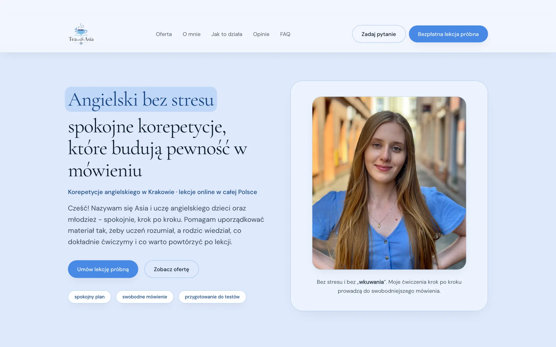
Project at a glance
Tea with Asia is the private practice of a tutor teaching English to children and teenagers in Kraków and online. We built the brand from scratch: logo, colour palette, tone of voice, and a friendly website that explains the offer to parents and drives free trial-lesson bookings.
Context & problem
Tea with Asia is the personal brand of a private English teacher working with children and teenagers in Kraków and online. The site is visited primarily by parents - and it is parents who make the decision.
The tutoring market is full of anonymous ads: a photo, a price, a phone number. A parent choosing a teacher for their child does not compare methodologies - they look for signals that there is a calm, competent, trustworthy person on the other side. An ad cannot send that signal.
At the same time, the teacher’s brand had to avoid both traps of the category: a stiff, "schoolish" image that scares children off, and an infantile aesthetic that undermines professionalism in a parent’s eyes.
There were also very practical parent questions to answer: what do lessons look like, how much do they cost, does the teacher work online, what about younger children, and will the parent know what happened in class. Missing answers mean private messages - or a lost visitor.
Constraints
Strategic principles
Within seconds, a parent should feel their child will be in good hands. Calm colours, a real photo, a first name, and the "stress-free English" promise - before any price appears.
The copy answers the parent’s questions (progress, post-lesson feedback, prices) but describes the child’s experience - no pressure, time to speak, mistakes treated as clues.
Instead of "effective learning" - a mapped-out 60-minute lesson plan, transparent pricing, and an FAQ with eight real parent questions. Specifics reassure better than claims.
One primary CTA across the site: a free trial lesson, no package commitment. A big decision broken into a small one.
Education and methodology are visible (English philology, teaching specialisation) but delivered in conversational language, not a rulebook.
Creative direction
The core brand idea sits in the name itself: English over tea. Learning as a calm, regular conversation - not another school lesson. Tea brings ritual, warmth, and a homely feel, while quietly linking the brand to the culture of the language being taught. Every visual and copy decision flows from this single metaphor.
Brand character
Tone of voice
The copy is written in the first person ("Hi! My name is Asia…") and speaks directly to the parent. Short sentences, zero methodology jargon, and only promises that can be kept: "I don’t promise miracles in a week. I promise regular work, clear explanations, and an atmosphere where asking questions is safe."
What we deliberately avoided
Logo story
The logo joins the brand’s two worlds in one image: a teacup rising from an open book. The steam above the cup turns into a speech bubble with an ellipsis - because the goal of the lessons is confident speaking. The mark deliberately moves away from schoolish tutoring symbols toward a calm, homely scene.

Learning and language growth - the foundation of the mark, on which the rest of the composition literally stands.
The calm, homely atmosphere of the lessons and a direct nod to the name - and to the English tea ritual.
The soft line of steam ends in a bubble with three dots - communication and speaking as the real goal of learning.
Details that warm the mark up and pull it away from a stiff tutoring image - care rather than decoration.
The full lockup - serif wordmark with a handwritten "with" - works in the site header and parent-facing materials. The cup-and-book symbol alone stays legible at small sizes: a social avatar or favicon. On the navy footer the mark runs in its lighter variant.
Colour system
The palette builds the balance the whole brand rests on: navy brings gravity and competence, blues bring calm and lightness, and gold adds a touch of quality without creating distance.
#0B1F3D
Base colour - headings, text, footer
It communicates stability, knowledge, and professionalism - what a parent looks for in a teacher. On light backgrounds it gives text strong, confident contrast.
#4989E6
Action colour - buttons, links, active elements
It lowers the navy’s formality and brings calm - it is what makes the site friendly rather than official. With white button text it keeps legible contrast.
#F4C66A
Highlights - review stars, the featured tier
It adds quality and warmth but appears strictly as a detail - never as a background for longer text, where it could not carry contrast. Where text on gold is needed, a darker variant steps in.
#F2F6FD
Section and page backgrounds
A very light, cool background improves readability of long content and builds a safe, airy atmosphere - separating sections without hard lines.
Typography
Pairing an elegant serif with a highly readable grotesque mirrors the brand: warmth and maturity in headings, full clarity in content.
400 · 500
Headings
Angielski bez stresu - spokojne korepetycje
A soft, classical serif gives the brand maturity and moves it away from the schoolish grotesque of typical tutoring ads. Its thin strokes need large sizes - which is why headings are set generously.
400 · 500
Body text and interface
Dobieram lekcje do wieku i potrzeb ucznia.
A highly readable interface face: pricing, the FAQ, and the signup form read effortlessly, phones included. The stylistic contrast with the serif organises hierarchy without extra ornament.
User flow
The site walks a parent through exactly the path their decision takes: first impression, then specifics, then dissolving concerns - and only then the signup.
A hero with a photo, a first name, and the "stress-free English" promise - the parent immediately sees who will teach their child.
The "Why my lessons?" section names four things parents genuinely value: an individual plan, teaching credentials, learning through play, and post-lesson feedback.
A four-step cooperation stepper and a mapped-out 60-minute plan - warm-up, new material, exercises, wrap-up.
Three age-based tiers with prices stated plainly and the most popular one flagged.
Parent reviews and the eight most common questions - from online lessons to feedback - before doubt appears.
The free trial-lesson form plus an "Ask a question" alternative for the undecided - no visit has to end in abandonment.
UX/UI decisions
Key interface sections
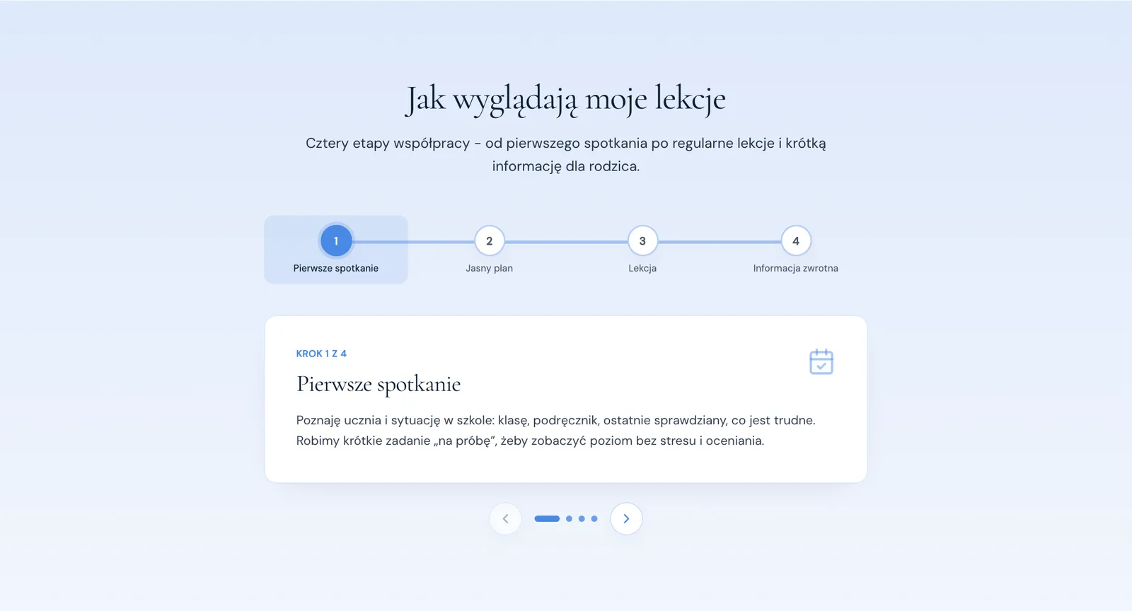
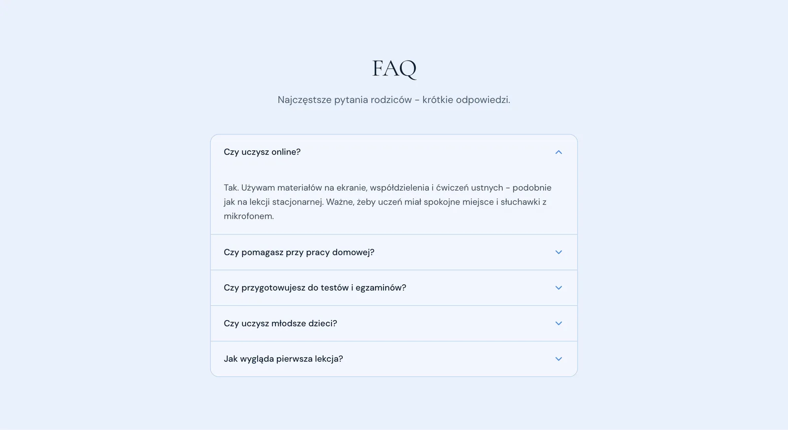
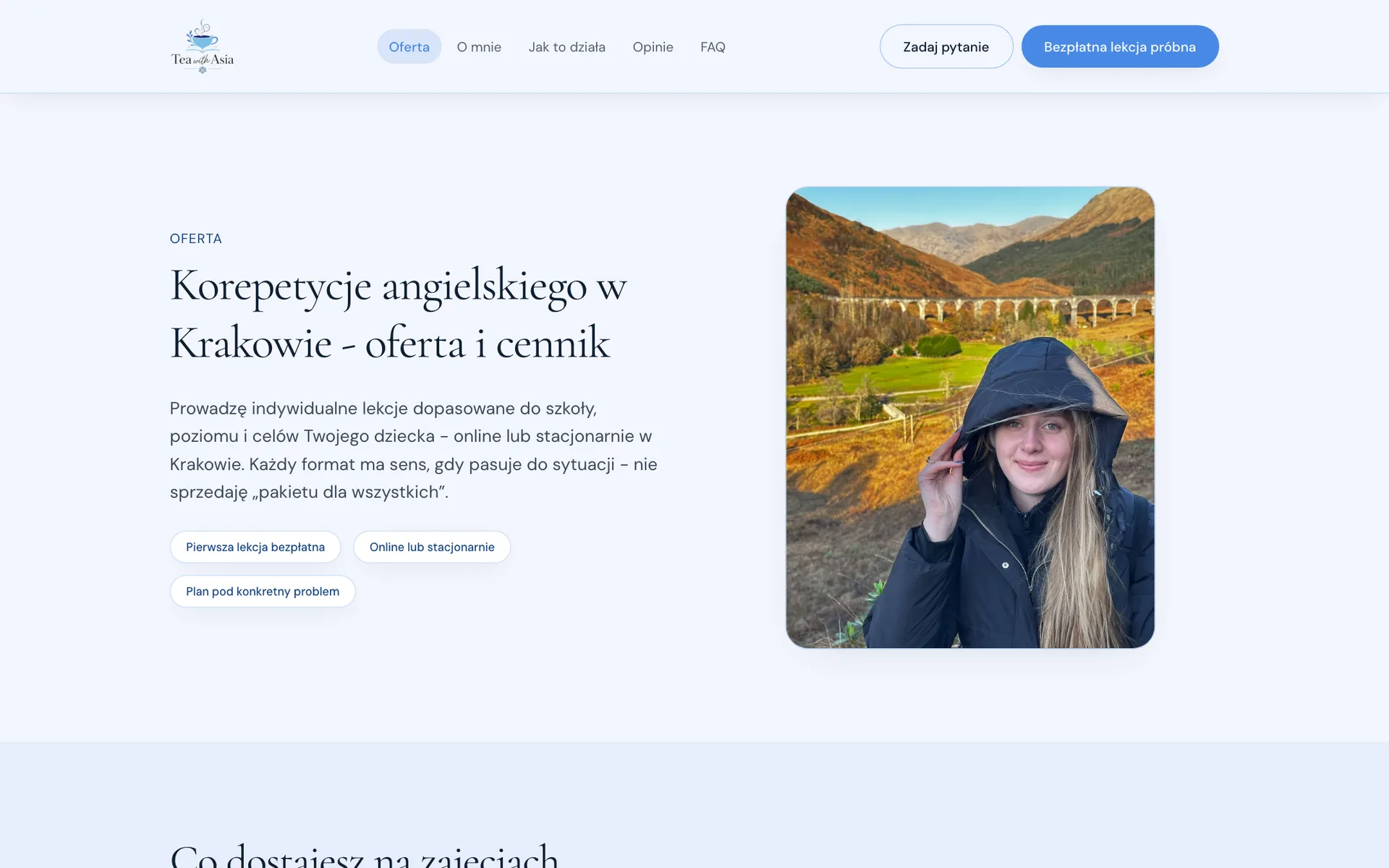
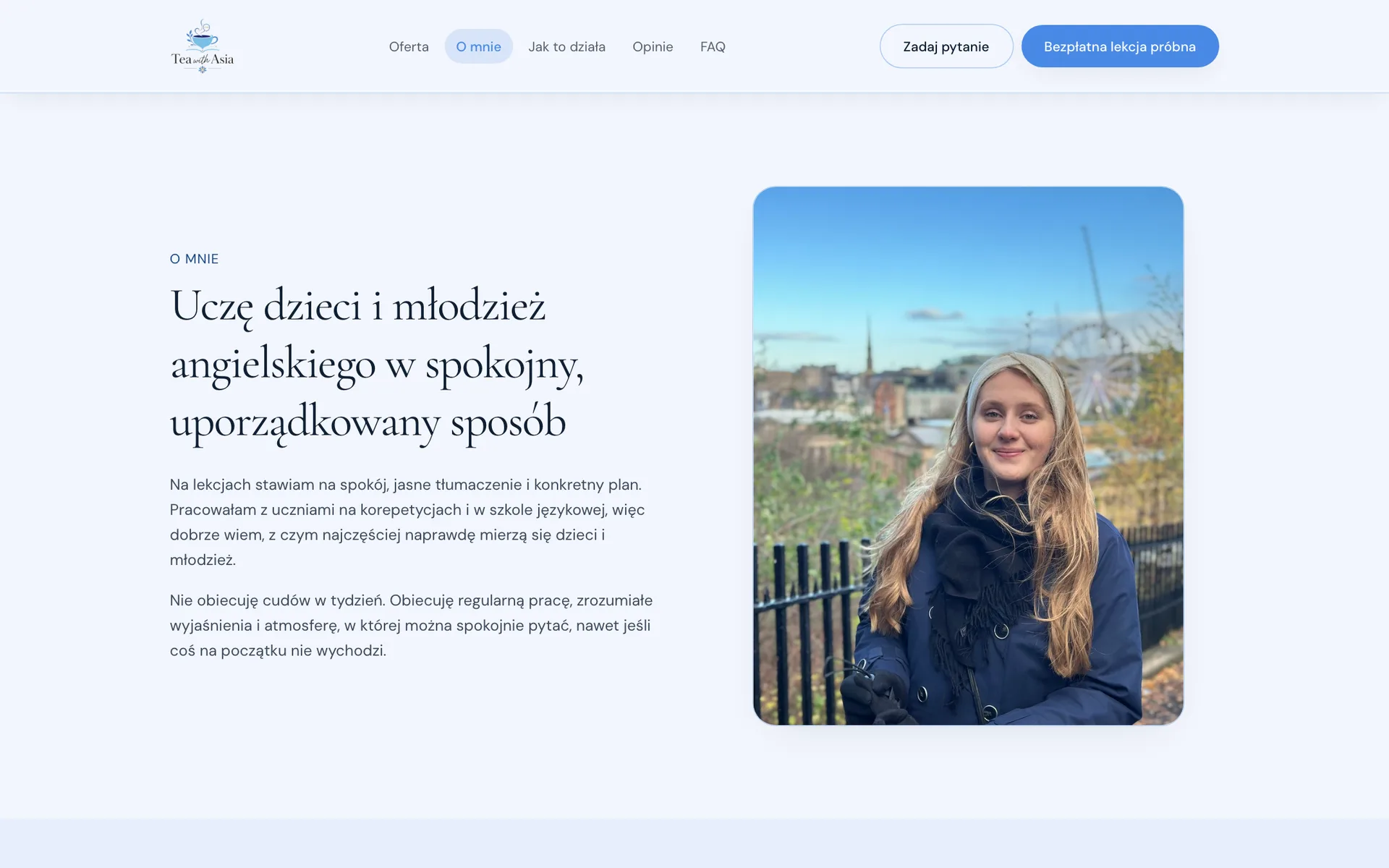
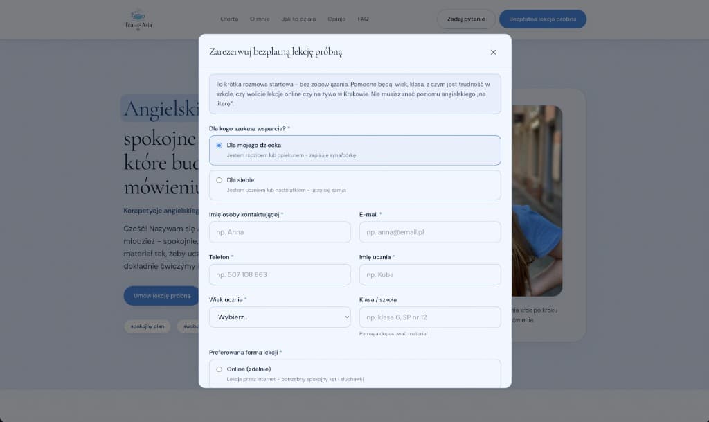
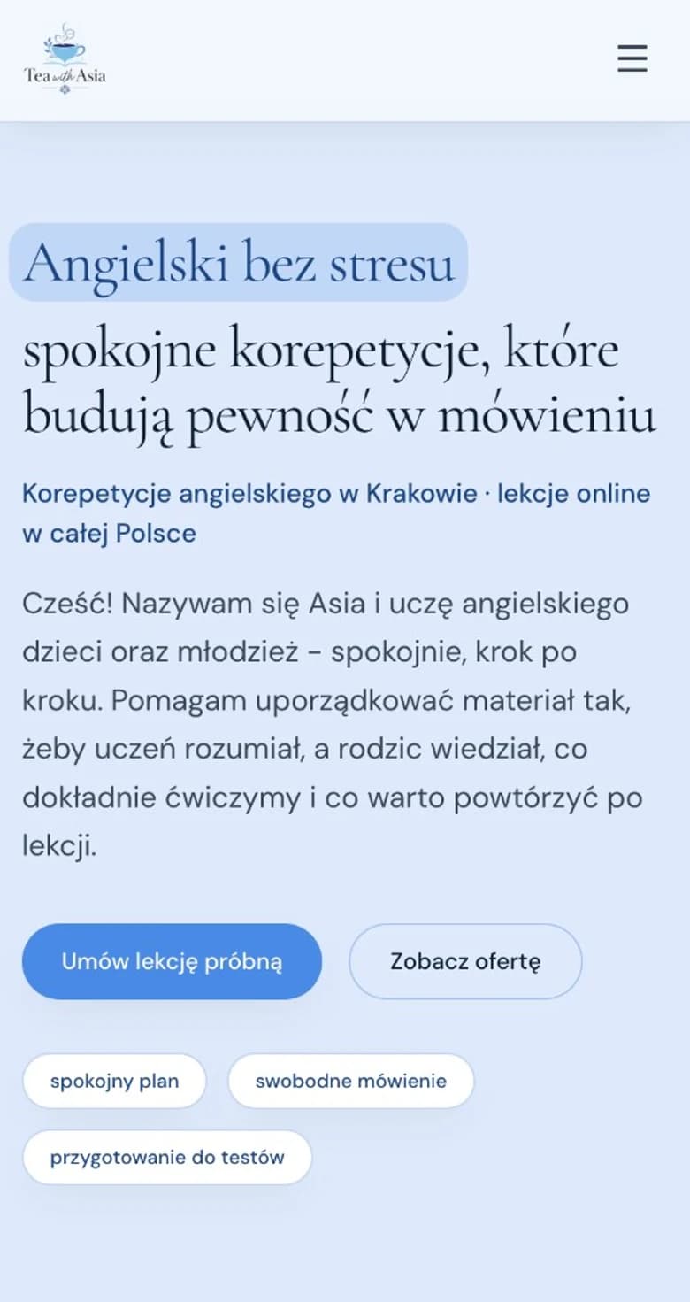
Mobile: the full hero-to-signup journey in one column, with large, comfortable fields.
From design to delivery
A light stack sized for a one-person brand - easy to maintain, cheap to host, and prepared for local SEO.
What we delivered
The key decision
This project best showed how to communicate professionalism without a cold, schoolish image. The answer was not stacking up certificates, but specifics delivered in warm language: a mapped-out lesson plan, transparent pricing, and the honest promise of "no miracles in a week". A parent’s trust is built through clarity - aesthetics should support it, not substitute for it.
Live site
Tea with Asia
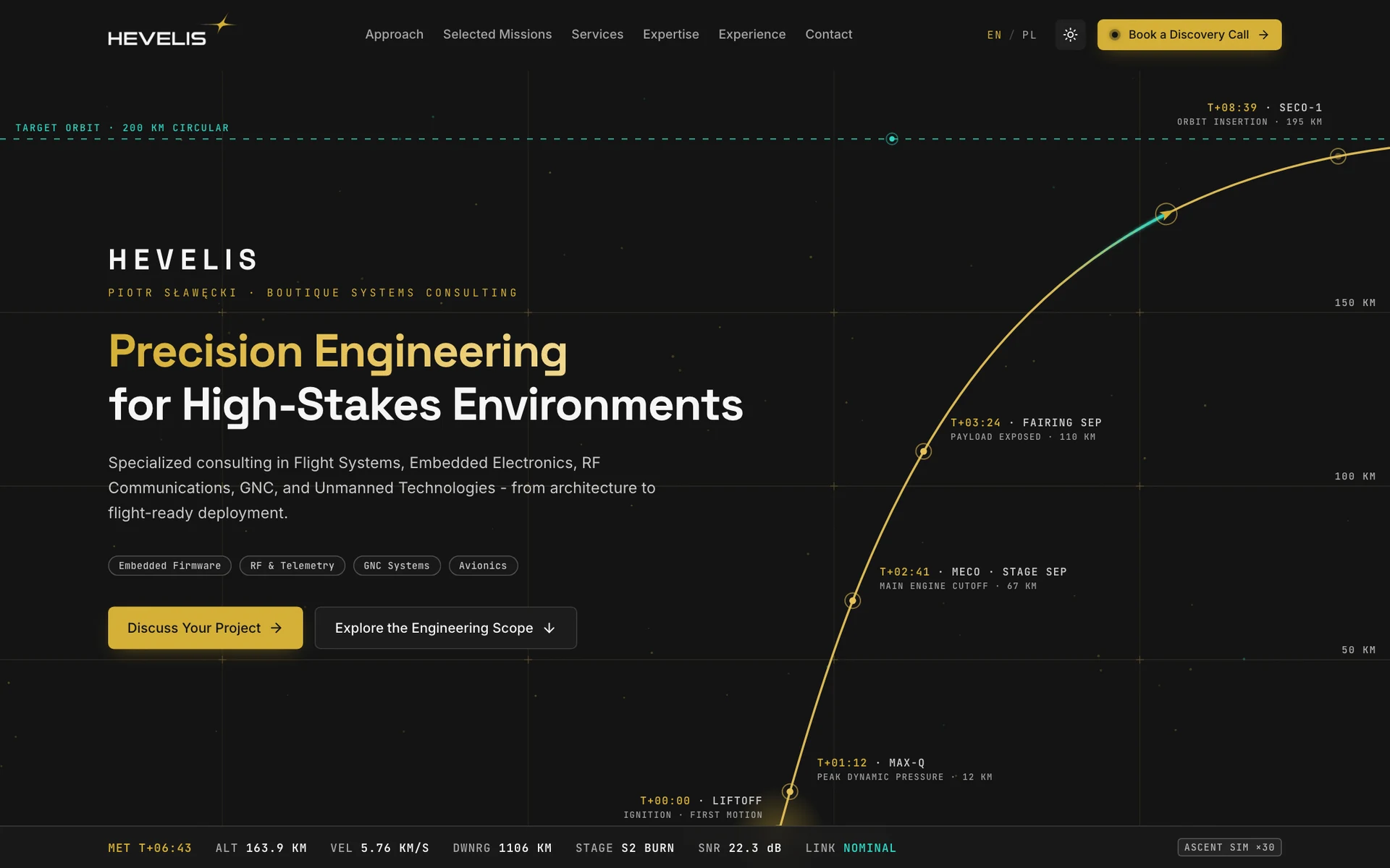
Brand identity and a bilingual website for aerospace and embedded systems consulting. A launch-trajectory hero, a clearly structured offer, and a direct path to a project conversation.
Building a personal brand you want clients to trust from the first visit? Let’s talk about your project.